In this tutorial, we’ll create a tabbed UI using Tailwind CSS and Alpine.js. We’ll build a basic tab structure and add functionality with Alpine.js. This guide avoids advanced features like hover effects or transitions to keep the implementation straightforward.
Steps to Create Tabs
- Set Up the Environment
- Create the Tab UI with Tailwind CSS
- Add Functionality with Alpine.js
- Customize Tab Colors
Step 1: Set Up the Environment
We’ll start by setting up our environment using Tailwind CSS and Alpine.js via CDN. Here’s the basic HTML structure:
<!DOCTYPE html>
<html lang="en">

<head>
    <meta charset="UTF-8" />
    <meta name="viewport" content="width=device-width, initial-scale=1.0" />
    <title>Tailwind CSS Tabs Tutorial with Alpine.js</title>
    <script src="https://cdn.tailwindcss.com"></script>

    <script defer src="https://cdn.jsdelivr.net/npm/[email protected]/dist/cdn.min.js"></script>
</head>

<body>
<!-- Content -->
</body>

</html>
Step 2: Create the Tab UI with Tailwind CSS
First, we’ll create the tab structure using Tailwind CSS. The tabs will be styled using Tailwind classes.
<div class="container mx-auto mt-10">
    <ul class="flex justify-center space-x-2 text-white">
        <li>
            <a href="#" class="inline-block px-4 py-2 bg-purple-500 text-white">Tab 1</a>
        </li>
        <li>
            <a href="#" class="inline-block px-4 py-2 bg-purple-500 text-white">Tab 2</a>
        </li>
        <li>
            <a href="#" class="inline-block px-4 py-2 bg-purple-500 text-white">Tab 3</a>
        </li>
    </ul>
    <div class="mt-6 bg-white border p-3">
        <div>Tab 1 Content...</div>
        <div>Tab 2 Content...</div>
        <div>Tab 3 Content...</div>
    </div>
</div>
Step 3: Add Functionality with Alpine.js
To make the tabs functional, we’ll use Alpine.js. This script will handle tab switching.
<div x-data="{ activeTab: 1 }" class="container mx-auto mt-10">
    <ul class="flex justify-center space-x-2 text-white">
        <li>
            <a href="#" x-on:click.prevent="activeTab = 1" :class="{ 'bg-red-500': activeTab === 1, 'bg-purple-500': activeTab !== 1 }" class="inline-block px-4 py-2">Tab 1</a>
        </li>
        <li>
            <a href="#" x-on:click.prevent="activeTab = 2" :class="{ 'bg-red-500': activeTab === 2, 'bg-purple-500': activeTab !== 2 }" class="inline-block px-4 py-2">Tab 2</a>
        </li>
        <li>
            <a href="#" x-on:click.prevent="activeTab = 3" :class="{ 'bg-red-500': activeTab === 3, 'bg-purple-500': activeTab !== 3 }" class="inline-block px-4 py-2">Tab 3</a>
        </li>
    </ul>
    <div class="mt-6 bg-white border p-3">
        <div x-show="activeTab === 1">Tab 1 Content...</div>
        <div x-show="activeTab === 2">Tab 2 Content...</div>
        <div x-show="activeTab === 3">Tab 3 Content...</div>
    </div>
</div>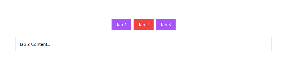
Step 4: Customize Tab Colors
To further customize the tab colors, you can use Alpine.js to conditionally apply classes based on the active tab.
<div x-data="{ activeTab: 1 }" class="container mx-auto mt-10">
    <ul class="flex justify-center space-x-2 text-white">
        <li>
            <a href="#" x-on:click.prevent="activeTab = 1" :class="{ 'bg-red-500': activeTab === 1, 'bg-purple-500': activeTab !== 1 }" class="inline-block px-4 py-2">Tab 1</a>
        </li>
        <li>
            <a href="#" x-on:click.prevent="activeTab = 2" :class="{ 'bg-red-500': activeTab === 2, 'bg-purple-500': activeTab !== 2 }" class="inline-block px-4 py-2">Tab 2</a>
        </li>
        <li>
            <a href="#" x-on:click.prevent="activeTab = 3" :class="{ 'bg-red-500': activeTab === 3, 'bg-purple-500': activeTab !== 3 }" class="inline-block px-4 py-2">Tab 3</a>
        </li>
    </ul>
    <div class="mt-6 bg-white border p-3">
        <div x-show="activeTab === 1">Tab 1 Content...</div>
        <div x-show="activeTab === 2">Tab 2 Content...</div>
        <div x-show="activeTab === 3">Tab 3 Content...</div>
    </div>
</div>
Conclusion
You’ve now created a simple yet functional tabbed UI using Tailwind CSS and Alpine.js. This setup provides a clean and efficient way to manage tabbed content without the need for complex JavaScript or CSS.