In this section we will create loading button with tailwind css. We will create outline loading button, disabled loading button, refresh loading button with Tailwind CSS.
Example 1
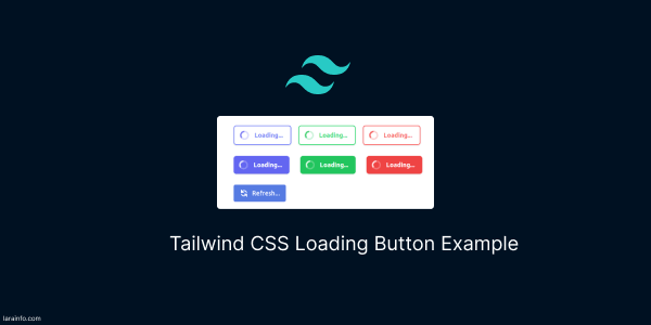
tailwind css simple loading button with disabled action.
<div class="flex items-center justify-center">
    <button type="button"
        class="inline-flex items-center px-4 py-2 text-sm font-semibold leading-6 text-white transition duration-150 ease-in-out bg-indigo-500 rounded-md shadow cursor-not-allowed hover:bg-indigo-400"
        disabled="">
        <svg class="w-5 h-5 mr-3 -ml-1 text-white animate-spin" xmlns="http://www.w3.org/2000/svg" fill="none"
            viewBox="0 0 24 24">
            <circle class="opacity-25" cx="12" cy="12" r="10" stroke="currentColor" stroke-width="4"></circle>
            <path class="opacity-75" fill="currentColor"
                d="M4 12a8 8 0 018-8V0C5.373 0 0 5.373 0 12h4zm2 5.291A7.962 7.962 0 014 12H0c0 3.042 1.135 5.824 3 7.938l3-2.647z">
            </path>
        </svg>
        Loading...
    </button>
</div>
<div class="flex items-center justify-center">
    <button type="button"
        class="inline-flex items-center px-4 py-2 text-sm font-semibold leading-6 text-white transition duration-150 ease-in-out bg-green-500 rounded-md shadow cursor-not-allowed hover:bg-green-400"
        disabled="">
        <svg class="w-5 h-5 mr-3 -ml-1 text-white animate-spin" xmlns="http://www.w3.org/2000/svg" fill="none"
            viewBox="0 0 24 24">
            <circle class="opacity-25" cx="12" cy="12" r="10" stroke="currentColor" stroke-width="4"></circle>
            <path class="opacity-75" fill="currentColor"
                d="M4 12a8 8 0 018-8V0C5.373 0 0 5.373 0 12h4zm2 5.291A7.962 7.962 0 014 12H0c0 3.042 1.135 5.824 3 7.938l3-2.647z">
            </path>
        </svg>
        Loading...
    </button>
</div>
<div class="flex items-center justify-center">
    <button type="button"
        class="inline-flex items-center px-4 py-2 text-sm font-semibold leading-6 text-white transition duration-150 ease-in-out bg-red-500 rounded-md shadow cursor-not-allowed hover:bg-red-400"
        disabled="">
        <svg class="w-5 h-5 mr-3 -ml-1 text-white animate-spin" xmlns="http://www.w3.org/2000/svg" fill="none"
            viewBox="0 0 24 24">
            <circle class="opacity-25" cx="12" cy="12" r="10" stroke="currentColor" stroke-width="4"></circle>
            <path class="opacity-75" fill="currentColor"
                d="M4 12a8 8 0 018-8V0C5.373 0 0 5.373 0 12h4zm2 5.291A7.962 7.962 0 014 12H0c0 3.042 1.135 5.824 3 7.938l3-2.647z">
            </path>
        </svg>
        Loading...
    </button>
</div>

tailwind v3 loading button
tailwind css outline loading button.
<div class="flex items-center justify-center">
    <button type="button"
        class="inline-flex items-center px-4 py-2 text-sm font-semibold leading-6 text-indigo-400 transition duration-150 ease-in-out border-2 border-indigo-400 rounded-md shadow cursor-not-allowed"
        disabled="">
        <svg class="w-5 h-5 mr-3 -ml-1 text-indigo-500 animate-spin" xmlns="http://www.w3.org/2000/svg" fill="none"
            viewBox="0 0 24 24">
            <circle class="opacity-25" cx="12" cy="12" r="10" stroke="currentColor" stroke-width="4"></circle>
            <path class="opacity-75" fill="currentColor"
                d="M4 12a8 8 0 018-8V0C5.373 0 0 5.373 0 12h4zm2 5.291A7.962 7.962 0 014 12H0c0 3.042 1.135 5.824 3 7.938l3-2.647z">
            </path>
        </svg>
        Loading...
    </button>
</div>
<div class="flex items-center justify-center">
    <button type="button"
        class="inline-flex items-center px-4 py-2 text-sm font-semibold leading-6 text-green-400 transition duration-150 ease-in-out border-2 border-green-400 rounded-md shadow cursor-not-allowed"
        disabled="">
        <svg class="w-5 h-5 mr-3 -ml-1 text-green-500 animate-spin" xmlns="http://www.w3.org/2000/svg" fill="none"
            viewBox="0 0 24 24">
            <circle class="opacity-25" cx="12" cy="12" r="10" stroke="currentColor" stroke-width="4"></circle>
            <path class="opacity-75" fill="currentColor"
                d="M4 12a8 8 0 018-8V0C5.373 0 0 5.373 0 12h4zm2 5.291A7.962 7.962 0 014 12H0c0 3.042 1.135 5.824 3 7.938l3-2.647z">
            </path>
        </svg>
        Loading...
    </button>
</div>
<div class="flex items-center justify-center">
    <button type="button"
        class="inline-flex items-center px-4 py-2 text-sm font-semibold leading-6 text-red-400 transition duration-150 ease-in-out border-2 border-red-400 rounded-md shadow cursor-not-allowed"
        disabled="">
        <svg class="w-5 h-5 mr-3 -ml-1 text-red-500 animate-spin" xmlns="http://www.w3.org/2000/svg" fill="none"
            viewBox="0 0 24 24">
            <circle class="opacity-25" cx="12" cy="12" r="10" stroke="currentColor" stroke-width="4"></circle>
            <path class="opacity-75" fill="currentColor"
                d="M4 12a8 8 0 018-8V0C5.373 0 0 5.373 0 12h4zm2 5.291A7.962 7.962 0 014 12H0c0 3.042 1.135 5.824 3 7.938l3-2.647z">
            </path>
        </svg>
        Loading...
    </button>
</div>

tailwind css outline loading button
Example 2
Refresh loading button with heroicons icons.
<button type="button" disabled=""
    class="inline-flex items-center justify-center w-auto px-3 py-2 space-x-2 text-sm font-medium text-white transition bg-blue-700 border border-blue-700 rounded appearance-none cursor-pointer select-none hover:border-blue-800 hover:bg-blue-800 focus:border-blue-300 focus:outline-none focus:ring-2 focus:ring-blue-300 disabled:pointer-events-none disabled:opacity-75">
    <svg xmlns="http://www.w3.org/2000/svg" class="w-5 h-5 animate-spin" viewBox="0 0 20 20" fill="currentColor">
        <path fill-rule="evenodd"
            d="M4 2a1 1 0 011 1v2.101a7.002 7.002 0 0111.601 2.566 1 1 0 11-1.885.666A5.002 5.002 0 005.999 7H9a1 1 0 010 2H4a1 1 0 01-1-1V3a1 1 0 011-1zm.008 9.057a1 1 0 011.276.61A5.002 5.002 0 0014.001 13H11a1 1 0 110-2h5a1 1 0 011 1v5a1 1 0 11-2 0v-2.101a7.002 7.002 0 01-11.601-2.566 1 1 0 01.61-1.276z"
            clip-rule="evenodd" />
    </svg>
    <span>Refresh...</span>
</button>

Refresh Loading button
Example 3
Create a button in Tailwind CSS with Alpine.js that triggers an onclick event to display a loading state.
<div x-data="{ loading: false }">
  <button :class="{'bg-gray-500': loading, 'bg-blue-500': !loading}"
    @click="loading = true; setTimeout(() => loading = false, 2000)" class="px-4 py-2 text-white rounded">
    <span x-show="!loading">Click Me</span>
    <span x-show="loading">Loading...</span>
  </button>
</div>
Tailwind CSS button with Alpine.js for an onclick event, featuring a loading state and a spinner icon.
<div x-data="{ loading: false }">
  <button @click="loading = true; setTimeout(() => loading = false, 2000)"
    class="flex items-center px-4 py-2 bg-blue-500 text-white rounded">
    <template x-if="loading">
      <svg class="w-5 h-5 mr-3 -ml-1 text-white animate-spin" xmlns="http://www.w3.org/2000/svg" fill="none"
        viewBox="0 0 24 24">
        <circle class="opacity-25" cx="12" cy="12" r="10" stroke="currentColor" stroke-width="4"></circle>
        <path class="opacity-75" fill="currentColor"
          d="M4 12a8 8 0 018-8V0C5.373 0 0 5.373 0 12h4zm2 5.291A7.962 7.962 0 014 12H0c0 3.042 1.135 5.824 3 7.938l3-2.647z">
        </path>
      </svg>
    </template>
    <span x-show="!loading">Click Me</span>
    <span x-show="loading">Loading...</span>
  </button>
</div>

tailwind alpinejs loading button
Read Also
Tailwind CSS 3 FAQ Accordion UI Example
Tailwind CSS 3 Alert Message Example
Tailwind CSS 3 Avatars Example
Tailwind CSS 3 Breadcrumb Example
Tailwind CSS Gradient Button Example
Tailwind CSS 3D Button Example
Tailwind CSS Loading Button Example
Tailwind CSS v3 Cards Examples
Tailwind CSS Checkbox Form Examples
Tailwind CSS Dropdowns (Menu) on Hover Example
Tailwind CSS Multiselect Dropdown Example
How to use dark mode toggle switch in Tailwind CSS 3
How to use @apply directive in Tailwind CSS
Tailwind CSS sticky header & fixed navbar example
Tailwind CSS Navbar UI Example
Tailwind CSS 3 Login Page UI Example
Tailwind CSS Login Modal Example
Tailwind CSS 3 Overlay Image Example
Tailwind CSS Thank You Page Example
Tailwind CSS Timeline UI Example
Tailwind CSS Responsive Footer Section Example
Tailwind CSS Background Image Header Example