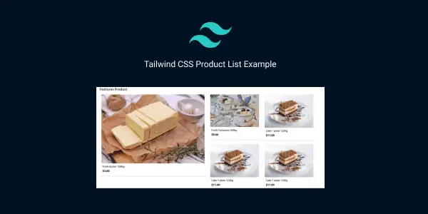
In this section we will create tailwind css product card list ui, tailwind css ecommerce product list, product list with 3 & 4 columns using grid, tailwind css responsive features nested product list , tailwind product wishlist with cart icon , example with Tailwind CSS.
How to install & setup Tailwind CSS v3
Example 1
tailwind css responsive product list using grid.
<div class="grid grid-cols-1 gap-4 lg:grid-cols-3 sm:grid-cols-2 ">
  <div class="w-full px-4 lg:px-0">
    <div class="p-3 bg-white rounded shadow-md">
      <div class="">
        <div class="relative w-full mb-3 h-62 lg:mb-0">
          <img src="https://cdn.pixabay.com/photo/2018/02/25/07/15/food-3179853__340.jpg" alt="Just a flower"
            class="object-fill w-full h-full rounded">
        </div>
        <div class="flex-auto p-2 justify-evenly">
          <div class="flex flex-wrap ">
            <div class="flex items-center justify-between w-full min-w-0 ">
              <h2 class="mr-auto text-lg cursor-pointer hover:text-gray-900 ">
                Fresh butter 100Kg
              </h2>
            </div>
          </div>
          <div class="mt-1 text-xl font-semibold">$3.00</div>

        </div>
      </div>
    </div>
  </div>
  <div class="w-full px-4 lg:px-0">
    <div class="p-3 bg-white rounded shadow-md">
      <div class="">
        <div class="relative w-full mb-3 h-62 lg:mb-0">
          <img src="https://cdn.pixabay.com/photo/2016/08/22/19/49/yogurt-1612787__340.jpg" alt="Just a flower"
            class="object-fill w-full h-full rounded">
        </div>
        <div class="flex-auto p-2 justify-evenly">
          <div class="flex flex-wrap ">
            <div class="flex items-center justify-between w-full min-w-0 ">
              <h2 class="mr-auto text-lg cursor-pointer hover:text-gray-900 ">
                Fresh Tomatoes 500kg
              </h2>
            </div>
          </div>
          <div class="mt-1 text-xl font-semibold">$9.00</div>

        </div>
      </div>
    </div>
  </div>
  <div class="w-full px-4 lg:px-0">
    <div class="p-3 bg-white rounded shadow-md">
      <div class="">
        <div class="relative w-full mb-3 h-62 lg:mb-0">
          <img src="https://cdn.pixabay.com/photo/2017/01/11/11/33/cake-1971552__480.jpg" alt="Just a flower"
            class="object-fill w-full h-full rounded">
        </div>
        <div class="flex-auto p-2 justify-evenly">
          <div class="flex flex-wrap ">
            <div class="flex items-center justify-between w-full min-w-0 ">
              <h2 class="mr-auto text-lg cursor-pointer hover:text-gray-900 ">
                Cake 1 plate 120Kg
              </h2>
            </div>
          </div>
          <div class="mt-1 text-xl font-semibold">$11.00</div>

        </div>
      </div>
    </div>
  </div>
</div>
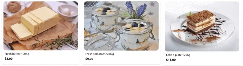
tailwind 3 product list
Example 2
Tailwind CSS Features Product list with Nested grid style.
<div class="px-4 mb-2 lg:px-0">
  <h1 class="text-2xl font-bold text-gray-700"> Features Product</h1>
</div>
<div class="grid grid-cols-1 gap-4 md:grid-cols-4 sm:grid-cols-2 ">

  <div class="w-full col-span-2 row-span-2 px-4 lg:px-0">

    <div class="p-3 bg-white rounded shadow-md">
      <div class="">
        <div class="relative w-full mb-3 h-62 lg:mb-0">
          <img src="https://cdn.pixabay.com/photo/2018/02/25/07/15/food-3179853__340.jpg" alt="Just a flower"
            class="object-fill w-full h-full rounded">
        </div>
        <div class="flex-auto p-2 justify-evenly">
          <div class="flex flex-wrap ">
            <div class="flex items-center justify-between w-full min-w-0 ">
              <h2 class="mr-auto text-lg cursor-pointer hover:text-gray-900 ">
                Fresh butter 100Kg
              </h2>
            </div>
          </div>
          <div class="mt-1 text-xl font-semibold">$3.00</div>

        </div>
      </div>
    </div>
  </div>
  <div class="w-full px-4 lg:px-0">
    <div class="p-3 bg-white rounded shadow-md">
      <div class="">
        <div class="relative w-full mb-3 h-62 lg:mb-0">
          <img src="https://cdn.pixabay.com/photo/2016/08/22/19/49/yogurt-1612787__340.jpg" alt="Just a flower"
            class="object-fill w-full h-full rounded">
        </div>
        <div class="flex-auto p-2 justify-evenly">
          <div class="flex flex-wrap ">
            <div class="flex items-center justify-between w-full min-w-0 ">
              <h2 class="mr-auto text-lg cursor-pointer hover:text-gray-900 ">
                Fresh Tomatoes 500kg
              </h2>
            </div>
          </div>
          <div class="mt-1 text-xl font-semibold">$9.00</div>

        </div>
      </div>
    </div>
  </div>
  <div class="w-full px-4 lg:px-0">
    <div class="p-3 bg-white rounded shadow-md">
      <div class="">
        <div class="relative w-full mb-3 h-62 lg:mb-0">
          <img src="https://cdn.pixabay.com/photo/2017/01/11/11/33/cake-1971552__480.jpg" alt="Just a flower"
            class="object-fill w-full h-full rounded">
        </div>
        <div class="flex-auto p-2 justify-evenly">
          <div class="flex flex-wrap ">
            <div class="flex items-center justify-between w-full min-w-0 ">
              <h2 class="mr-auto text-lg cursor-pointer hover:text-gray-900 ">
                Cake 1 plate 120Kg
              </h2>
            </div>
          </div>
          <div class="mt-1 text-xl font-semibold">$11.00</div>

        </div>
      </div>
    </div>
  </div>
</div>
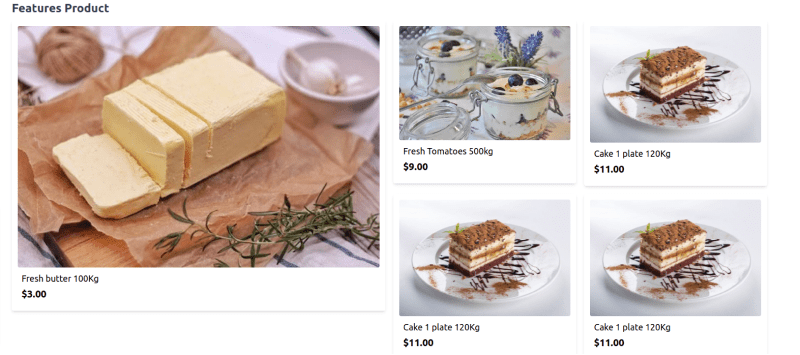
tailwind features product list
Example 3
tailwind css product card wishlist with add to cart button.
<div class="w-full lg:max-w-lg px-4 lg:px-0">
  <div class="p-3 bg-white rounded shadow-md">
    <div class="">
      <div class="relative w-full mb-3 h-62 lg:mb-0">
        <div class="absolute top-0 right-0 flex flex-col p-3">
          <span class="text-red-800 cursor-pointer hover:text-red-500">

            <svg xmlns="http://www.w3.org/2000/svg" class="w-6 h-6 " fill="none" viewBox="0 0 24 24"
              stroke="currentColor">
              <path stroke-linecap="round" stroke-linejoin="round" stroke-width="2"
                d="M4.318 6.318a4.5 4.5 0 000 6.364L12 20.364l7.682-7.682a4.5 4.5 0 00-6.364-6.364L12 7.636l-1.318-1.318a4.5 4.5 0 00-6.364 0z" />
            </svg>
            </svg>
          </span>
        </div>
        <img src="https://cdn.pixabay.com/photo/2018/02/25/07/15/food-3179853__340.jpg" alt="Just a flower"
          class="object-fill w-full h-full rounded">
      </div>
      <div class="flex-auto p-2 justify-evenly">
        <div class="flex flex-wrap ">
          <div class="flex items-center justify-between w-full min-w-0 ">
            <h2 class="mr-auto text-lg cursor-pointer hover:text-gray-900 ">
              Fresh butter 100Kg
            </h2>
          </div>
        </div>
        <div class="mt-1 text-xl font-semibold">$3.00</div>
        <div class="mt-4">
          <button
            class="inline-flex items-center px-4 py-2 text-indigo-100 bg-indigo-700 rounded-md hover:bg-indigo-800">

            <svg xmlns="http://www.w3.org/2000/svg" class="w-5 h-5 mr-2 text-white" fill="none" viewBox="0 0 24 24"
              stroke="currentColor">
              <path stroke-linecap="round" stroke-linejoin="round" stroke-width="2"
                d="M3 3h2l.4 2M7 13h10l4-8H5.4M7 13L5.4 5M7 13l-2.293 2.293c-.63.63-.184 1.707.707 1.707H17m0 0a2 2 0 100 4 2 2 0 000-4zm-8 2a2 2 0 11-4 0 2 2 0 014 0z" />
            </svg>
            <span>Add to Cart</span>
          </button>
        </div>
      </div>
    </div>
  </div>
</div>
Example 4
Create an attractive product list with product cards that smoothly scale on hover using Tailwind CSS.
<div class="container mx-auto p-8">
    <h1 class="text-4xl font-bold mb-8">Product List</h1>

    <div class="grid grid-cols-1 sm:grid-cols-2 md:grid-cols-3 lg:grid-cols-4 gap-8">
        <!-- Product Card 1 -->
        <div class="bg-white p-6 rounded-lg shadow-md transition-transform transform hover:scale-105">
            <img src="https://source.unsplash.com/random/400x300" alt="Product Image" class="mb-4 rounded-md">
            <h2 class="text-xl font-bold mb-2">Stylish Watch</h2>
            <p class="text-gray-700">Elegant design with a leather strap. Perfect for any occasion.</p>
            <div class="mt-4 flex items-center justify-between">
                <span class="text-blue-500 font-bold">$149.99</span>
                <button class="bg-blue-500 text-white px-4 py-2 rounded-md hover:bg-blue-600">Add to Cart</button>
            </div>
        </div>

        <!-- Product Card 2 -->
        <div class="bg-white p-6 rounded-lg shadow-md transition-transform transform hover:scale-105">
            <img src="https://source.unsplash.com/random/400x300" alt="Product Image" class="mb-4 rounded-md">
            <h2 class="text-xl font-bold mb-2">Wireless Earbuds</h2>
            <p class="text-gray-700">Enjoy high-quality sound and comfort with these wireless earbuds.</p>
            <div class="mt-4 flex items-center justify-between">
                <span class="text-blue-500 font-bold">$79.99</span>
                <button class="bg-blue-500 text-white px-4 py-2 rounded-md hover:bg-blue-600">Add to Cart</button>
            </div>
        </div>

        <!-- Product Card 3 -->
        <div class="bg-white p-6 rounded-lg shadow-md transition-transform transform hover:scale-105">
            <img src="https://source.unsplash.com/random/400x300" alt="Product Image" class="mb-4 rounded-md">
            <h2 class="text-xl font-bold mb-2">Smartphone Stand</h2>
            <p class="text-gray-700">Adjustable stand for smartphones. Keep your device in the perfect viewing angle.
            </p>
            <div class="mt-4 flex items-center justify-between">
                <span class="text-blue-500 font-bold">$24.99</span>
                <button class="bg-blue-500 text-white px-4 py-2 rounded-md hover:bg-blue-600">Add to Cart</button>
            </div>
        </div>
    </div>
</div>
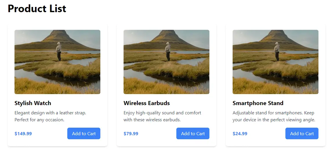
tailwind product list page
Read Also
Tailwind CSS 3 FAQ Accordion UI Example
Tailwind CSS 3 Alert Message Example
Tailwind CSS 3 Avatars Example
Tailwind CSS 3 Breadcrumb Example
Tailwind CSS Gradient Button Example
Tailwind CSS 3D Button Example
Tailwind CSS Loading Button Example
Tailwind CSS v3 Cards Examples
Tailwind CSS Checkbox Form Examples
Tailwind CSS Dropdowns (Menu) on Hover Example
Tailwind CSS Multiselect Dropdown Example
How to use dark mode toggle switch in Tailwind CSS 3
How to use @apply directive in Tailwind CSS
Tailwind CSS sticky header & fixed navbar example
Tailwind CSS Navbar UI Example
Tailwind CSS 3 Login Page UI Example
Tailwind CSS Login Modal Example
Tailwind CSS 3 Overlay Image Example
Tailwind CSS Thank You Page Example
Tailwind CSS Timeline UI Example
Tailwind CSS Responsive Footer Section Example
Tailwind CSS Background Image Header Example