In this tutorial, we will creating a to-do app UI using Tailwind CSS. We’ll cover designing a to-do app list with icons, implementing a sidebar, and organizing task categories with Tailwind CSS.
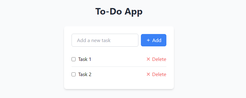
Tailwind CSS To DO APP UI Example
In a container div (max-w-md, centered), there’s a header (“To-Do App”) and a div with a white background, rounded corners, and shadow, containing an input field and “Add” button. Input is styled with borders and rounded corners, while the button has a blue background with hover effect. Tasks are listed in an unordered list with checkboxes, task text, and “Delete” buttons, separated by horizontal lines.
<div class="max-w-md mx-auto py-8">
    <header class="text-center mb-8">
        <h1 class="text-3xl font-bold text-gray-800">To-Do App</h1>
    </header>

    <div class="bg-white rounded-lg shadow-md p-6">
        <div class="flex items-center mb-4">
            <input
                class="w-full px-4 py-2 border border-gray-300 rounded-md focus:outline-none focus:ring-2 focus:ring-blue-500"
                type="text" placeholder="Add a new task">
            <button class="ml-2 px-4 py-2 bg-blue-500 text-white rounded-md hover:bg-blue-600">Add</button>
        </div>

        <ul class="divide-y divide-gray-200">
            <li class="py-3 flex items-center justify-between">
                <div class="flex items-center">
                    <input type="checkbox" class="mr-2">
                    <span>Task 1</span>
                </div>
                <button class="text-red-500 hover:text-red-600">Delete</button>
            </li>
            <li class="py-3 flex items-center justify-between">
                <div class="flex items-center">
                    <input type="checkbox" class="mr-2">
                    <span>Task 2</span>
                </div>
                <button class="text-red-500 hover:text-red-600">Delete</button>
            </li>
        </ul>
    </div>
</div>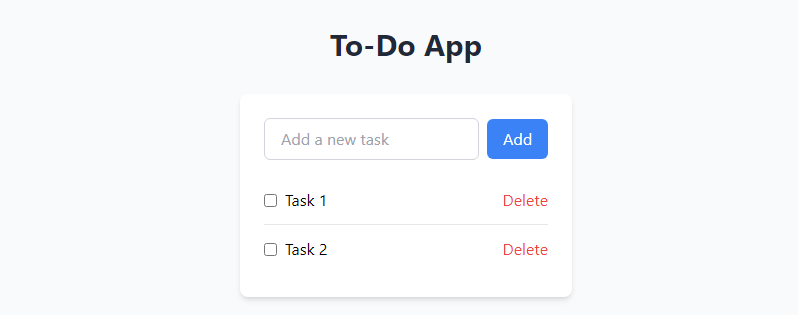
to-do app sidebar and task categories
The sidebar, styled with white background, shadow, and padding, features task categories displayed as links in an unordered list, with the active category highlighted in blue. The main content area, utilizing flexbox, showcases a header, an input field for adding tasks, and a task list with checkboxes and delete buttons, all displayed side by side with the sidebar.
<div class="bg-gray-100 flex">
    <aside class="bg-white shadow-md p-4 mr-4">
        <h2 class="text-xl font-semibold mb-4">Categories</h2>
        <ul class="space-y-2">
            <li><a href="#" class="block px-4 py-2 bg-blue-500 text-white rounded-md hover:bg-blue-600">All</a></li>
            <li><a href="#" class="block px-4 py-2 bg-gray-200 rounded-md hover:bg-gray-300">Work</a></li>
            <li><a href="#" class="block px-4 py-2 bg-gray-200 rounded-md hover:bg-gray-300">Personal</a></li>
        </ul>
    </aside>

    <div class="flex-1">
        <header class="text-center mb-8">
            <h1 class="text-3xl font-bold text-gray-800">To-Do App</h1>
        </header>

        <div class="bg-white rounded-lg shadow-md p-6 mb-4">
            <div class="flex items-center mb-4">
                <input
                    class="w-full px-4 py-2 border border-gray-300 rounded-md focus:outline-none focus:ring-2 focus:ring-blue-500"
                    type="text" placeholder="Add a new task">
                <button class="ml-2 px-4 py-2 bg-blue-500 text-white rounded-md hover:bg-blue-600">Add</button>
            </div>
        </div>

        <div class="bg-white rounded-lg shadow-md p-6">
            <h2 class="text-xl font-semibold mb-4">Tasks</h2>
            <ul class="divide-y divide-gray-200">
                <li class="py-3 flex items-center justify-between">
                    <div class="flex items-center">
                        <input type="checkbox" class="mr-2">
                        <span>Task 1</span>
                    </div>
                    <button class="text-red-500 hover:text-red-600">Delete</button>
                </li>
                <li class="py-3 flex items-center justify-between">
                    <div class="flex items-center">
                        <input type="checkbox" class="mr-2">
                        <span>Task 2</span>
                    </div>
                    <button class="text-red-500 hover:text-red-600">Delete</button>
                </li>
            </ul>
        </div>
    </div>
</div>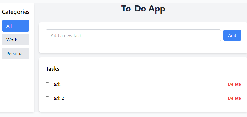
to-do app with icon
SVG icons have been integrated into the “Add” and “Delete” buttons using the element and styled with Tailwind CSS. For the “Add” button, a plus icon is added using with defined shape attributes and styled with a width and height of 4 pixels, along with margin-right and text color inheritance. Similarly, for the “Delete” buttons, an “X” icon is incorporated with attributes, also styled with width, height, margin-right, and text color inheritance. These SVG icons are enclosed in a
or element, utilizing flex and items-center utilities for vertical alignment of icon and text.
<div class="mx-auto max-w-md py-8">
    <header class="mb-8 text-center">
        <h1 class="text-3xl font-bold text-gray-800">To-Do App</h1>
    </header>

    <div class="rounded-lg bg-white p-6 shadow-md">
        <div class="mb-4 flex items-center">
            <input
                class="w-full rounded-md border border-gray-300 px-4 py-2 focus:outline-none focus:ring-2 focus:ring-blue-500"
                type="text" placeholder="Add a new task" />
            <button class="ml-2 flex items-center rounded-md bg-blue-500 px-4 py-2 text-white hover:bg-blue-600">
                <svg class="mr-1 h-4 w-4" fill="none" stroke="currentColor" viewBox="0 0 24 24"
                    xmlns="http://www.w3.org/2000/svg">
                    <path stroke-linecap="round" stroke-linejoin="round" stroke-width="2"
                        d="M12 6v6m0 0v6m0-6h6m-6 0H6"></path>
                </svg>
                Add
            </button>
        </div>

        <ul class="divide-y divide-gray-200">
            <li class="flex items-center justify-between py-3">
                <div class="flex items-center">
                    <input type="checkbox" class="mr-2" />
                    <span>Task 1</span>
                </div>
                <button class="flex items-center text-red-500 hover:text-red-600">
                    <svg class="mr-1 h-4 w-4" fill="none" stroke="currentColor" viewBox="0 0 24 24"
                        xmlns="http://www.w3.org/2000/svg">
                        <path stroke-linecap="round" stroke-linejoin="round" stroke-width="2" d="M6 18L18 6M6 6l12 12">
                        </path>
                    </svg>
                    Delete
                </button>
            </li>
            <li class="flex items-center justify-between py-3">
                <div class="flex items-center">
                    <input type="checkbox" class="mr-2" />
                    <span>Task 2</span>
                </div>
                <button class="flex items-center text-red-500 hover:text-red-600">
                    <svg class="mr-1 h-4 w-4" fill="none" stroke="currentColor" viewBox="0 0 24 24"
                        xmlns="http://www.w3.org/2000/svg">
                        <path stroke-linecap="round" stroke-linejoin="round" stroke-width="2" d="M6 18L18 6M6 6l12 12">
                        </path>
                    </svg>
                    Delete
                </button>
            </li>
        </ul>
    </div>
</div>