To create an overlay effect with Tailwind CSS, apply utility classes to control the layout, positioning, color, and size of a semi-transparent layer. Overlays are commonly used for modals, popups, loading screens, and to emphasize or dim underlying content.
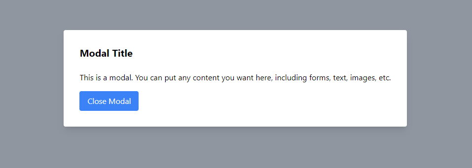
Modal with Overlay
Modals require an overlay on the page content to focus the user's attention on the modal content.
<div class="min-h-screen flex items-center justify-center">
  <!-- Overlay -->
  <div class="absolute inset-0 bg-gray-500 opacity-75"></div>

  <!-- Modal -->
  <div class="bg-white p-8 rounded shadow-lg z-10">
    <h2 class="text-xl font-bold mb-6">Modal Title</h2>
    <p class="mb-4">
      This is a modal. You can put any content you want here, including forms,
      text, images, etc.
    </p>
    <button class="bg-blue-500 text-white px-4 py-2 rounded hover:bg-blue-700">
      Close Modal
    </button>
  </div>
</div>
tailwind overlay tutorial
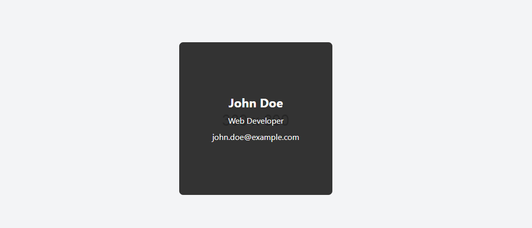
Image Overlay
Image overlays are useful for providing additional information or actions related to the image when the user hovers over or clicks on it.
<div class="flex items-center justify-center h-screen bg-gray-100">
  <div class="relative">
    <img
      src="https://via.placeholder.com/300"
      alt="User name"
      class="rounded-lg"
    />

    <!-- Overlay: hidden by default and shown on hover -->
    <div
      class="absolute inset-0 bg-black bg-opacity-75 flex items-center justify-center opacity-0 hover:opacity-100 transition-opacity duration-500 rounded-lg"
    >
      <div class="text-center text-white">
        <h2 class="text-2xl font-bold">John Doe</h2>
        <p class="mt-2">Web Developer</p>
        <p class="mt-2">[email protected]</p>
      </div>
    </div>
  </div>
</div>
tailwind overlay example
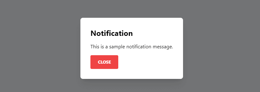
Notification Popup with Overlay
This example shows a notification message with an overlay that could be used for announcements, alerts, or confirmations.
<div class="bg-gray-200 flex items-center justify-center h-screen">
  <!-- Trigger button -->
  <button
    id="showNotification"
    class="bg-green-500 text-white active:bg-green-600 font-bold uppercase text-sm px-6 py-3 rounded shadow hover:shadow-lg outline-none focus:outline-none"
  >
    Show Notification
  </button>

  <!-- Notification container, hidden by default -->
  <div
    id="notification"
    class="fixed inset-0 bg-black bg-opacity-50 hidden items-center justify-center p-4 z-50"
  >
    <div class="bg-white p-8 rounded-lg shadow-xl">
      <h2 class="font-bold text-2xl mb-4">Notification</h2>
      <p class="mb-4">This is a sample notification message.</p>
      <button
        id="closeNotification"
        class="bg-red-500 text-white active:bg-red-600 font-bold uppercase text-sm px-6 py-3 rounded"
      >
        Close
      </button>
    </div>
  </div>

  <script>
    let showButton = document.getElementById("showNotification");

    let notification = document.getElementById("notification");

    let closeButton = document.getElementById("closeNotification");

    showButton.onclick = function () {
      notification.style.display = "flex";
    };

    closeButton.onclick = function () {
      notification.style.display = "none";
    };
  </script>
</div>
tailwind overlay