In this section, we'll create a simple landing page using Tailwind CSS. Before we start make sure you install & setup tailwind css in you system.
Easy Tailwind CSS Integration with CDN for HTML
Step 1: Plan Your Landing Page
Before you write any code, decide what content and sections your landing page will include. Typical sections might be:
1. Header/Navigation
2. Main section (Hero)
3. Features
4. Testimonials
5. Contact Us
6. Footer
Step 2: Build the Header/Navigation
Start with a simple navigation bar. You might want it to be fixed, so it stays at the top of the page when users scroll.
<header class="bg-gray-800 text-white p-4 fixed w-full z-10">
  <nav class="container mx-auto flex justify-between">
    <a href="#" class="text-2xl font-bold">BrandName</a>
    <div>
      <a href="#" class="text-lg px-2">Home</a>
      <a href="#" class="text-lg px-2">Features</a>
      <a href="#" class="text-lg px-2">Pricing</a>
      <a href="#" class="text-lg px-2">Contact</a>
    </div>
  </nav>
</header>

tailwind landing page navbar
If you're interested in creating a responsive navbar using Alpine.js, you can refer to the article below.
Tailwind CSS Hamburger Menu Examples
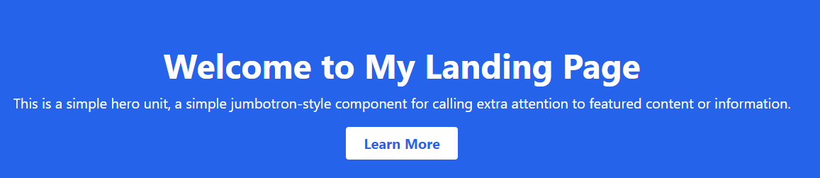
Step 3: Create the Hero Section
This is typically a large header view that immediately follows your site navigation.
<section class="hero bg-blue-600 text-white pt-20 pb-10 text-center">
  <h1 class="text-5xl font-bold">Welcome to My Landing Page</h1>
  <p class="text-xl mt-4">
    This is a simple hero unit, a simple jumbotron-style component for calling
    extra attention to featured content or information.
  </p>
  <button
    class="bg-white text-blue-600 hover:bg-gray-100 text-xl font-bold py-2 px-6 border border-transparent rounded mt-5"
  >
    Learn More
  </button>
</section>
tailwind landing page header
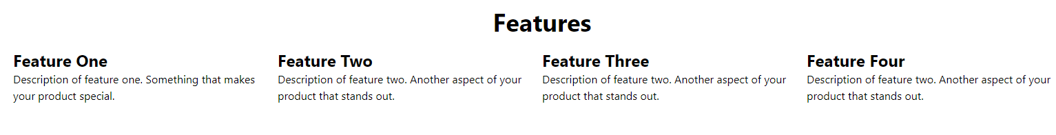
Step 4: Add Features Section
Creating a Simple Features Section: 1, 2, 3, 4. Also you can grid class.
<section class="flex flex-col items-center py-10">
  <h2 class="text-4xl font-bold mb-5">Features</h2>
  <div class="flex flex-wrap justify-around">
    <div class="max-w-sm">
      <h3 class="text-2xl font-bold">Feature One</h3>
      <p>
        Description of feature one. Something that makes your product special.
      </p>
    </div>
    <div class="max-w-sm">
      <h3 class="text-2xl font-bold">Feature Two</h3>
      <p>
        Description of feature two. Another aspect of your product that stands
        out.
      </p>
    </div>
    <div class="max-w-sm">
      <h3 class="text-2xl font-bold">Feature Three</h3>
      <p>
        Description of feature two. Another aspect of your product that stands
        out.
      </p>
    </div>
    <div class="max-w-sm">
      <h3 class="text-2xl font-bold">Feature Four</h3>
      <p>
        Description of feature two. Another aspect of your product that stands
        out.
      </p>
    </div>
  </div>
</section>
tailwind landing features section
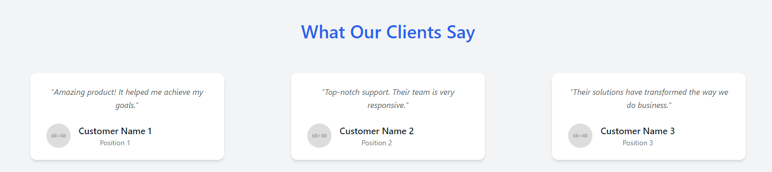
Step 5: Testimonials Section
Next, let's move on to creating a Testimonials Section using the grid class from Tailwind CSS.
<section class="bg-gray-100 py-20" id="testimonials">
  <div class="container mx-auto px-4 text-center">
    <h2 class="text-4xl font-semibold text-blue-600 mb-16">
      What Our Clients Say
    </h2>

    <div class="grid grid-cols-1 md:grid-cols-2 lg:grid-cols-3 gap-12">
      <div
        class="max-w-sm mx-auto bg-white rounded-xl shadow-md overflow-hidden hover:shadow-lg transition-shadow duration-300">
        <div class="px-8 py-6">
          <p class="text-gray-600 italic leading-relaxed">
            "Amazing product! It helped me achieve my goals."
          </p>
          <div class="mt-6 flex items-center">
            <img class="w-12 h-12 rounded-full mr-4" src="https://placehold.co/600x400/png" alt="Customer Name 1" />
            <div>
              <p class="text-lg font-semibold text-gray-900">Customer Name 1</p>
              <p class="text-sm text-gray-500">Position 1</p>
            </div>
          </div>
        </div>
      </div>

      <div
        class="max-w-sm mx-auto bg-white rounded-xl shadow-md overflow-hidden hover:shadow-lg transition-shadow duration-300">
        <div class="px-8 py-6">
          <p class="text-gray-600 italic leading-relaxed">
            "Top-notch support. Their team is very responsive."
          </p>
          <div class="mt-6 flex items-center">
            <img class="w-12 h-12 rounded-full mr-4" src="https://placehold.co/600x400/png" alt="Customer Name 2" />
            <div>
              <p class="text-lg font-semibold text-gray-900">Customer Name 2</p>
              <p class="text-sm text-gray-500">Position 2</p>
            </div>
          </div>
        </div>
      </div>

      <div
        class="max-w-sm mx-auto bg-white rounded-xl shadow-md overflow-hidden hover:shadow-lg transition-shadow duration-300">
        <div class="px-8 py-6">
          <p class="text-gray-600 italic leading-relaxed">
            "Their solutions have transformed the way we do business."
          </p>
          <div class="mt-6 flex items-center">
            <img class="w-12 h-12 rounded-full mr-4" src="https://placehold.co/600x400/png" alt="Customer Name 3" />
            <div>
              <p class="text-lg font-semibold text-gray-900">Customer Name 3</p>
              <p class="text-sm text-gray-500">Position 3</p>
            </div>
          </div>
        </div>
      </div>
    </div>
  </div>
</section>
tailwind landing testimonials section
Step 6: Design the Contact Form
Next, we'll design our form with input fields for the user's name, email address, a message, and a submit button.
<section class="relative py-16 bg-white" id="contact">
  <div class="container mx-auto px-4">
    <div class="relative w-full text-center py-4">
      <h2 class="text-4xl font-semibold text-blue-600">Get in Touch</h2>
      <p class="text-lg leading-relaxed mt-4 text-gray-500">
        Feel free to drop us a message, we are here to answer any question you
        may have.
      </p>
    </div>
  </div>
  <div class="container mx-auto">
    <form action="/submit_form_endpoint" method="POST" class="w-full max-w-lg mx-auto mt-6">
      <div class="flex flex-wrap -mx-3 mb-6">
        <div class="w-full px-3">
          <label class="block uppercase tracking-wide text-gray-700 text-xs font-bold mb-2" for="name">
            Full Name
          </label>
          <input
            class="appearance-none block w-full bg-gray-200 text-gray-700 rounded py-3 px-4 mb-3 leading-tight focus:outline-none focus:bg-gray-100"
            id="name" type="text" placeholder="John Doe" required />
        </div>
      </div>
      <div class="flex flex-wrap -mx-3 mb-6">
        <div class="w-full px-3">
          <label class="block uppercase tracking-wide text-gray-700 text-xs font-bold mb-2" for="email">
            E-mail
          </label>
          <input
            class="appearance-none block w-full bg-gray-200 text-gray-700 rounded py-3 px-4 mb-3 leading-tight focus:outline-none focus:bg-gray-100"
            id="email" type="email" placeholder="[email protected]" required />
        </div>
      </div>
      <div class="flex flex-wrap -mx-3 mb-6">
        <div class="w-full px-3">
          <label class="block uppercase tracking-wide text-gray-700 text-xs font-bold mb-2" for="message">
            Message
          </label>
          <textarea
            class="no-resize appearance-none block w-full bg-gray-200 text-gray-700 rounded py-3 px-4 mb-3 leading-tight focus:outline-none focus:bg-gray-100 h-48 resize-none"
            id="message" required></textarea>
        </div>
      </div>
      <div class="md:flex md:items-center">
        <div class="md:w-1/3">
          <button
            class="shadow bg-blue-600 hover:bg-blue-700 focus:shadow-outline focus:outline-none text-white font-bold py-2 px-4 rounded"
            type="submit">
            Send
          </button>
        </div>
        <div class="md:w-2/3"></div>
      </div>
    </form>
  </div>
</section>
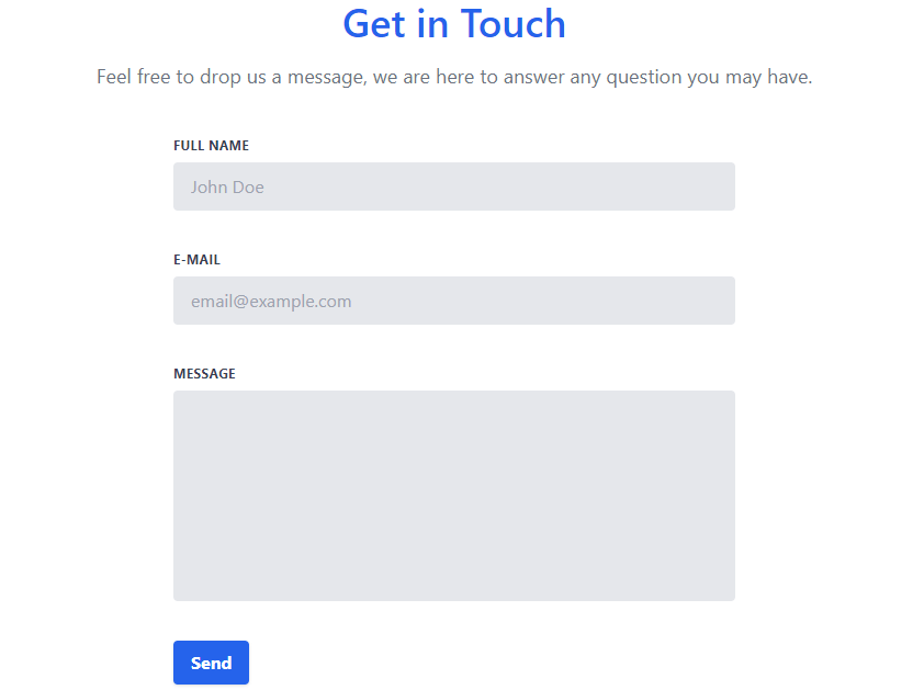
tailwind landing contact us section
Step 7: Create a Simple Footer
A simple footer to end the page.
<footer class="py-6 bg-gray-900">
<div class="container mx-auto text-center text-gray-200">
<p class="mb-6">© 2023 BrandName. All rights reserved.</p>
<p>Privacy Policy | Terms & Conditions | Contact Us</p>
</div>
</footer>

tailwind landing footer section
FFF