This tutorial will guide you through creating a responsive modal component in React JS using Tailwind CSS. We’ll cover two approaches: building a reusable modal component and using a fully-managed, renderless dialog component with Headless UI and Tailwind CSS & React.
Tool Use
React JS
Tailwind CSS
Headless UI
First you need to setup react project with tailwind css. You can install manually or you read below blog.
How to install Tailwind CSS in React
Install & Setup Vite + React + Typescript + Tailwind CSS 3
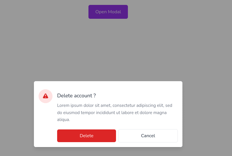
Example 1
Let’s create a basic dialog modal using React JS and Tailwind CSS.
import { useState } from "react";

export default function Modal() {
    const [showModal, setShowModal] = useState(false);
    return (
        <>
            <div className="flex items-center justify-center h-60">
                <button
                    className="px-6 py-3 text-purple-100 bg-purple-600 rounded-md"
                    type="button"
                    onClick={() => setShowModal(true)}
                >
                    Open Modal
                </button>
            </div>
            {showModal ? (
                <>
                    <div className="fixed inset-0 z-10 overflow-y-auto">
                        <div
                            className="fixed inset-0 w-full h-full bg-black opacity-40"
                            onClick={() => setShowModal(false)}
                        ></div>
                        <div className="flex items-center min-h-screen px-4 py-8">
                            <div className="relative w-full max-w-lg p-4 mx-auto bg-white rounded-md shadow-lg">
                                <div className="mt-3 sm:flex">
                                    <div className="flex items-center justify-center flex-none w-12 h-12 mx-auto bg-red-100 rounded-full">
                                        <svg
                                            xmlns="http://www.w3.org/2000/svg"
                                            className="w-6 h-6 text-red-600"
                                            viewBox="0 0 20 20"
                                            fill="currentColor"
                                        >
                                            <path
                                                fillRule="evenodd"
                                                d="M8.257 3.099c.765-1.36 2.722-1.36 3.486 0l5.58 9.92c.75 1.334-.213 2.98-1.742 2.98H4.42c-1.53 0-2.493-1.646-1.743-2.98l5.58-9.92zM11 13a1 1 0 11-2 0 1 1 0 012 0zm-1-8a1 1 0 00-1 1v3a1 1 0 002 0V6a1 1 0 00-1-1z"
                                                clipRule="evenodd"
                                            />
                                        </svg>
                                    </div>
                                    <div className="mt-2 text-center sm:ml-4 sm:text-left">
                                        <h4 className="text-lg font-medium text-gray-800">
                                            Delete account ?
                                        </h4>
                                        <p className="mt-2 text-[15px] leading-relaxed text-gray-500">
                                            Lorem ipsum dolor sit amet,
                                            consectetur adipiscing elit, sed do
                                            eiusmod tempor incididunt ut labore
                                            et dolore magna aliqua.
                                        </p>
                                        <div className="items-center gap-2 mt-3 sm:flex">
                                            <button
                                                className="w-full mt-2 p-2.5 flex-1 text-white bg-red-600 rounded-md outline-none ring-offset-2 ring-red-600 focus:ring-2"
                                                onClick={() =>
                                                    setShowModal(false)
                                                }
                                            >
                                                Delete
                                            </button>
                                            <button
                                                className="w-full mt-2 p-2.5 flex-1 text-gray-800 rounded-md outline-none border ring-offset-2 ring-indigo-600 focus:ring-2"
                                                onClick={() =>
                                                    setShowModal(false)
                                                }
                                            >
                                                Cancel
                                            </button>
                                        </div>
                                    </div>
                                </div>
                            </div>
                        </div>
                    </div>
                </>
            ) : null}
        </>
    );
}
Example 2
Build a Reusable Modal Component with React and Tailwind CSS.
import React from "react";

export default function Modal({ setOpenModal }) {
    return (
        <>
            <div className="fixed inset-0 z-10 overflow-y-auto">
                <div
                    className="fixed inset-0 w-full h-full bg-black opacity-40"
                    onClick={() => setOpenModal(false)}
                ></div>
                <div className="flex items-center min-h-screen px-4 py-8">
                    <div className="relative w-full max-w-lg p-4 mx-auto bg-white rounded-md shadow-lg">
                        <div className="mt-3 sm:flex">
                            <div className="flex items-center justify-center flex-none w-12 h-12 mx-auto bg-red-100 rounded-full">
                                <svg
                                    xmlns="http://www.w3.org/2000/svg"
                                    className="w-6 h-6 text-red-600"
                                    viewBox="0 0 20 20"
                                    fill="currentColor"
                                >
                                    <path
                                        fillRule="evenodd"
                                        d="M8.257 3.099c.765-1.36 2.722-1.36 3.486 0l5.58 9.92c.75 1.334-.213 2.98-1.742 2.98H4.42c-1.53 0-2.493-1.646-1.743-2.98l5.58-9.92zM11 13a1 1 0 11-2 0 1 1 0 012 0zm-1-8a1 1 0 00-1 1v3a1 1 0 002 0V6a1 1 0 00-1-1z"
                                        clipRule="evenodd"
                                    />
                                </svg>
                            </div>
                            <div className="mt-2 text-center sm:ml-4 sm:text-left">
                                <h4 className="text-lg font-medium text-gray-800">
                                    Delete account ?
                                </h4>
                                <p className="mt-2 text-[15px] leading-relaxed text-gray-500">
                                    Lorem ipsum dolor sit amet, consectetur
                                    adipiscing elit, sed do eiusmod tempor
                                    incididunt ut labore et dolore magna aliqua.
                                </p>
                                <div className="items-center gap-2 mt-3 sm:flex">
                                    <button
                                        className="w-full mt-2 p-2.5 flex-1 text-white bg-red-600 rounded-md outline-none ring-offset-2 ring-red-600 focus:ring-2"
                                        onClick={() => setOpenModal(false)}
                                    >
                                        Delete
                                    </button>
                                    <button
                                        className="w-full mt-2 p-2.5 flex-1 text-gray-800 rounded-md outline-none border ring-offset-2 ring-indigo-600 focus:ring-2"
                                        onClick={() => setOpenModal(false)}
                                    >
                                        Cancel
                                    </button>
                                </div>
                            </div>
                        </div>
                    </div>
                </div>
            </div>
        </>
    );
}
Now import Model.jsx in App.jsx.
import React, { useState } from "react";
import Modal from "./Components/Modal";

export default function App() {
    const [showModal, setShowModal] = useState(false);

    return (
        <div className="flex flex-col items-center justify-center h-60">
            <h1 className="text-2xl font-bold">
                Click on the button to open the modal.
            </h1>
            <button
                className="px-4 py-2 text-purple-100 bg-purple-600 rounded-md"
                type="button"
                onClick={() => {
                    setShowModal(true);
                }}
            >
                Open Modal
            </button>

            {showModal && <Modal setOpenModal={setShowModal} />}
        </div>
    );
}
Example 3
Headless UI offers a powerful solution for creating modals. As a fully-managed, renderless dialog component, it handles accessibility and keyboard interactions seamlessly. This library empowers you to build completely custom modal and dialog windows, perfectly suited for your next application.
Install Headless UI
To get started, install Headless UI via npm:
npm install @headlessui/reactimport { Dialog, Transition } from '@headlessui/react'
import { Fragment, useState } from 'react'
export default function MyModal() {
let [isOpen, setIsOpen] = useState(true)
function closeModal() {
setIsOpen(false)
}
function openModal() {
setIsOpen(true)
}
return (
<>
<div className="fixed inset-0 flex items-center justify-center">
<button
type="button"
onClick={openModal}
className="px-4 py-2 text-sm font-medium text-white bg-black rounded-md bg-opacity-20 hover:bg-opacity-30 focus:outline-none focus-visible:ring-2 focus-visible:ring-white focus-visible:ring-opacity-75"
>
Open dialog
</button>
</div>
<Transition appear show={isOpen} as={Fragment}>
<Dialog as="div" className="relative z-10" onClose={closeModal}>
<Transition.Child
as={Fragment}
enter="ease-out duration-300"
enterFrom="opacity-0"
enterTo="opacity-100"
leave="ease-in duration-200"
leaveFrom="opacity-100"
leaveTo="opacity-0"
>
<div className="fixed inset-0 bg-black bg-opacity-25" />
</Transition.Child>
<div className="fixed inset-0 overflow-y-auto">
<div className="flex items-center justify-center min-h-full p-4 text-center">
<Transition.Child
as={Fragment}
enter="ease-out duration-300"
enterFrom="opacity-0 scale-95"
enterTo="opacity-100 scale-100"
leave="ease-in duration-200"
leaveFrom="opacity-100 scale-100"
leaveTo="opacity-0 scale-95"
>
<Dialog.Panel className="w-full max-w-md p-6 overflow-hidden text-left align-middle transition-all transform bg-white shadow-xl rounded-2xl">
<Dialog.Title
as="h3"
className="text-lg font-medium leading-6 text-gray-900"
>
Payment successful
</Dialog.Title>
<div className="mt-2">
<p className="text-sm text-gray-500">
Your payment has been successfully submitted. We’ve sent
you an email with all of the details of your order.
</p>
</div>
<div className="mt-4">
<button
type="button"
className="inline-flex justify-center px-4 py-2 text-sm font-medium text-blue-900 bg-blue-100 border border-transparent rounded-md hover:bg-blue-200 focus:outline-none focus-visible:ring-2 focus-visible:ring-blue-500 focus-visible:ring-offset-2"
onClick={closeModal}
>
Got it, thanks!
</button>
</div>
</Dialog.Panel>
</Transition.Child>
</div>
</div>
</Dialog>
</Transition>
</>
)
}