Build Responsive Cards for Your React App with Tailwind CSS. Learn to create reusable card components and side-by-side layouts using Tailwind’s grid system.
Tool Use
React JS
Tailwind CSS
First you need to setup react project with tailwind css. You can install manually or you read below blog.
How to install Tailwind CSS in React
Install & Setup Vite + React + Typescript + Tailwind CSS 3
Example 1
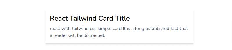
React tailwind css simple card.
import React from "react";

export default function CardComponent() {
    return (
        <div className="w-full p-4 shadow-md lg:max-w-lg">
            <div className="space-y-2">
                <h3 className="text-2xl font-semibold">
                    React Tailwind Card Title
                </h3>
                <p className="text-gray-600">
                    react with tailwind css simple card It is a long established
                    fact that a reader will be distracted.
                </p>
            </div>
        </div>
    );
}
Example 2
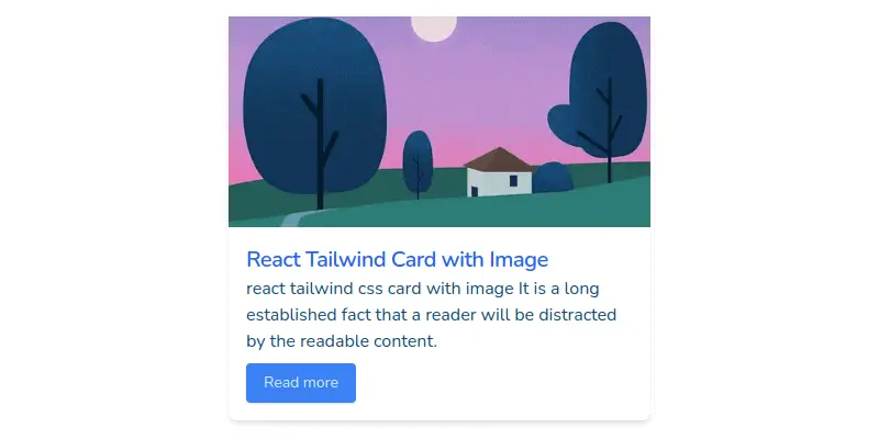
React tailwind css card with image.
import React from "react";

export default function CardComponent() {
    return (
        <div className="w-full rounded-lg shadow-md lg:max-w-sm">
            <img
                className="object-cover w-full h-48"
                src="https://cdn.pixabay.com/photo/2022/08/18/09/20/houses-7394390__340.jpg"
                alt="image"
            />
            <div className="p-4">
                <h4 className="text-xl font-semibold tracking-tight text-blue-600">
                    React Tailwind Card with Image
                </h4>
                <p className="mb-2 leading-normal">
                    react tailwind css card with image It is a long established
                    fact that a reader will be distracted by the readable
                    content.
                </p>
                <button className="px-4 py-2 text-sm text-blue-100 bg-blue-500 rounded shadow">
                    Read more
                </button>
            </div>
        </div>
    );
}
Example 3
React tailwind responsive horizontal card image.
import React from "react";

export default function CardComponent() {
    return (
        <div className="w-full p-2 rounded-lg shadow-xl lg:flex lg:max-w-lg">
            <img
                className="object-cover w-full lg:w-40 lg:h-40"
                src="https://cdn.pixabay.com/photo/2022/08/18/09/20/houses-7394390__340.jpg"
                alt="image"
            />
            <div className="pl-2">
                <h4 className="text-xl font-semibold tracking-tight text-blue-600">
                    react tailwind horizontal card image
                </h4>
                <p className="mb-2 leading-normal">
                    react tailwind css horizontal card with image It is a long
                    established fact that a reader will be distracted by the
                    readable content.
                </p>
                <button className="px-4 py-2 text-sm text-blue-100 bg-blue-500 rounded shadow">
                    Read more
                </button>
            </div>
        </div>
    );
}
Example 4
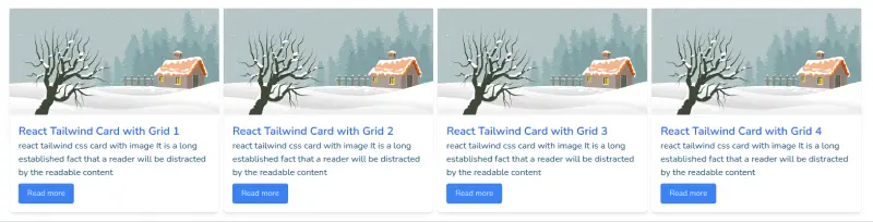
React tailwind css side by side card using tailwind grid.
import React from "react";

export default function CardComponent() {
    const posts = [
        {
            title: "React Tailwind Card with Grid 1",
            img: "https://cdn.pixabay.com/photo/2019/12/17/14/43/christmas-4701783__340.png",
            content: "react tailwind css card with image It is a long established fact that a reader will be distracted by the readable content"
        },
        {
            title: "React Tailwind Card with Grid 2",
            img: "https://cdn.pixabay.com/photo/2019/12/17/14/43/christmas-4701783__340.png",
            content: "react tailwind css card with image It is a long established fact that a reader will be distracted by the readable content"
        },
        {
            title: "React Tailwind Card with Grid 3",
            img: "https://cdn.pixabay.com/photo/2019/12/17/14/43/christmas-4701783__340.png",
            content: "react tailwind css card with image It is a long established fact that a reader will be distracted by the readable content"
        },
        {
            title: "React Tailwind Card with Grid 4",
            img: "https://cdn.pixabay.com/photo/2019/12/17/14/43/christmas-4701783__340.png",
            content: "react tailwind css card with image It is a long established fact that a reader will be distracted by the readable content"
        },
    ];
    return (
        <>
            <div className="grid gap-2 lg:grid-cols-4">
                {posts.map((items, key) => (
                    <div className="w-full rounded-lg shadow-md lg:max-w-sm" key={key}>
                        <img
                            className="object-cover w-full h-48"
                            src={items.img}
                            alt="image"
                        />
                        <div className="p-4">
                            <h4 className="text-xl font-semibold text-blue-600">

                                {items.title}
                            </h4>
                            <p className="mb-2 leading-normal">
                            {items.content}
                            </p>
                            <button className="px-4 py-2 text-sm text-blue-100 bg-blue-500 rounded shadow">
                                Read more
                            </button>
                        </div>
                    </div>
                ))}
            </div>
        </>
    );
}