Neobrutalism, a design approach that combines the stark, raw qualities of Brutalism with modern design elements, has been gaining traction in web design. It's characterized by bold, raw, and utilitarian aesthetics, often with a focus on asymmetric layouts, plain backgrounds, stark contrasts, and direct typography.
Tailwind CSS, a utility-first CSS framework, doesn't come with pre-built Neobrutalist components out of the box. However, you can use its utility classes to create a Neobrutalism style by adhering to the principles of the design aesthetic.
Create a Neobrutalism UI Card Using Tailwind CSS
Here how to use it Neobrutalism in Tailwind CSS.
<div class="bg-gray-100 text-gray-900 font-sans">
<div class="container mx-auto p-4">
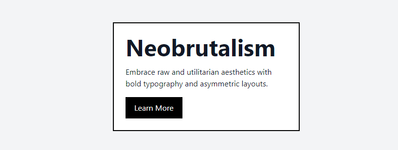
<div class="bg-white p-6 max-w-sm mx-auto border-2 border-black">
<h1 class="text-5xl font-bold mb-4">Neobrutalism</h1>
<p class="mb-4">
Embrace raw and utilitarian aesthetics with bold typography and
asymmetric layouts.
</p>
<button
class="bg-black text-white py-2 px-4 border-2 border-black hover:bg-gray-700"
>
Learn More
</button>
</div>
</div>
</div>
1. The bg-gray-100 class sets a plain, light background color, which is common in Neobrutalism design.
2. The border-2 border-black classes create a thick, black border around the card, contributing to the raw and stark aesthetic.
3. The text-5xl font-bold classes make the heading large and impactful, which is a hallmark of Neobrutalist typography.
4. The max-w-sm and mx-auto classes are used to control the width of the card and center it on the page, creating a focused and direct presentation.
The button has a solid fill with a contrasting color (bg-black text-white) and a border, which stands out against the background.
learn tailwind css neobrutalism
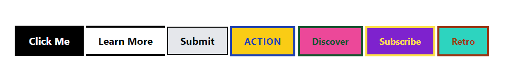
Learn how to Create Neobrutalism Buttons In Tailwind CSS
1. Design a stark black and white button with Tailwind CSS for a minimalist interface.
2. Implement an asymmetrical border button using Tailwind CSS for a modern, edgy layout.
3. Craft a raw-edged button in Tailwind CSS to add a touch of organic texture to your webpage.
4. Embrace bold and colorful neobrutalism with a Tailwind CSS button that makes a statement.
5. Generate a vibrant duo-tone button with Tailwind CSS for a lively and dynamic user experience.
6. Illuminate your design with an electric neon button created through Tailwind CSS for that extra pop.
7. Revisit classic styles by creating a retro contrast button with Tailwind CSS for a nostalgic feel.
<button
  class="px-6 py-3 bg-black text-white font-bold text-xl border-4 border-black hover:bg-transparent hover:text-black transition-colors duration-300">
  Click Me
</button>
<button
  class="px-6 py-3 bg-transparent text-black font-bold text-xl border-t-4 border-b-4 border-black hover:border-l-4 hover:border-r-4 transition-border duration-300">
  Learn More
</button>
<button
  class="px-6 py-3 bg-gray-200 text-black font-bold text-xl border-2 border-black hover:bg-gray-400 transition-colors duration-300">
  Submit
</button>
<button
  class="px-6 py-3 bg-yellow-400 text-blue-800 font-bold text-lg uppercase tracking-wider border-4 border-blue-800 hover:bg-blue-800 hover:text-yellow-400 transition-colors duration-300">
  Action
</button>
<button
  class="px-6 py-3 bg-pink-500 text-green-900 font-bold text-lg border-4 border-green-900 hover:bg-green-900 hover:text-pink-500 transition-colors duration-300">
  Discover
</button>
<button
  class="px-6 py-3 bg-purple-700 text-yellow-300 font-bold text-lg border-4 border-yellow-300 hover:bg-yellow-300 hover:text-purple-700 transition-colors duration-300">
  Subscribe
</button>
<button
  class="px-6 py-3 bg-teal-400 text-orange-800 font-bold text-lg border-4 border-orange-800 hover:bg-orange-800 hover:text-teal-400 transition-colors duration-300">
  Retro
</button>
tailwind css neobrutalism button a tutorial
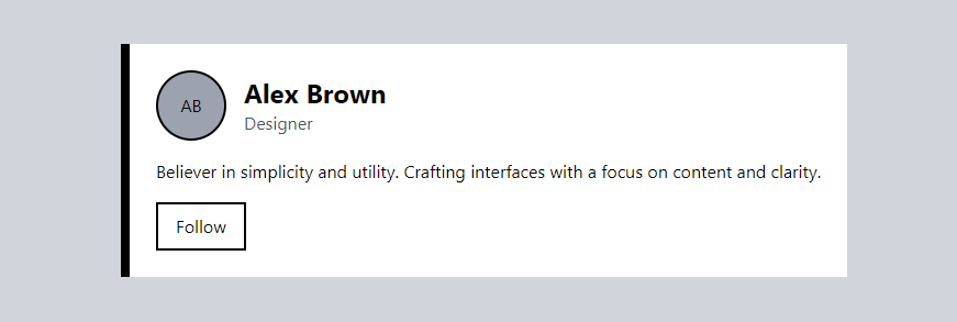
Neobrutalism Profile Card
1. The border-l-8 border-black creates a thick left border, giving the card a strong visual anchor.
2. The avatar placeholder with bg-gray-400 and border-2 border-black uses simple geometric shapes and stark borders.
3. The hover:bg-black hover:text-white on the button adds a high-contrast interaction, which is visually striking and typical of Neobrutalist design.
<div class="min-h-screen bg-gray-300 flex items-center justify-center">
 <div class="p-6 bg-white border-l-8 border-black">
  <div class="flex items-center space-x-4">
   <div class="rounded-full h-16 w-16 flex items-center justify-center border-2 border-black bg-gray-400">AB</div>
   <div>
    <h2 class="text-2xl font-bold">Alex Brown</h2>
    <p class="text-gray-600">Designer</p>
   </div>
  </div>
  <p class="mt-4">Believer in simplicity and utility. Crafting interfaces with a focus on content and clarity.</p>
  <button class="mt-4 py-2 px-4 bg-transparent text-black border-2 border-black hover:bg-black hover:text-white">Follow</button>
 </div>
</div>
tailwind css neobrutalism card a tutorial