In this section, we'll build a modal dialog using Tailwind CSS and JavaScript. We'll explore the creation of a dialog modal that closes when clicked outside, design a responsive modal, and add animations to enhance the user experience.
Example 1
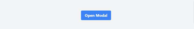
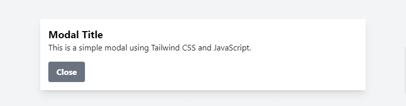
Create a simple modal dialog using Tailwind CSS and JavaScript.
<!DOCTYPE html>
<html lang="en">
<head>
    <meta charset="UTF-8">
    <meta name="viewport" content="width=device-width, initial-scale=1.0">
    <script src="https://cdn.tailwindcss.com"></script>
    <title>Tailwind CSS Modal</title>
</head>
<body class="bg-gray-100 flex items-center justify-center min-h-screen">
    <button id="openModal" class="bg-blue-500 hover:bg-blue-700 text-white font-bold py-2 px-4 rounded">Open Modal</button>

    <div id="modal" class="fixed top-0 left-0 w-full h-full flex items-center justify-center hidden">
        <div class="modal-dialog bg-white rounded shadow-lg w-1/3">
            <div class="modal-content p-4">
                <h2 class="text-xl font-bold">Modal Title</h2>
                <p>This is a simple modal using Tailwind CSS and JavaScript.</p>
                <button id="closeModal" class="bg-gray-500 hover:bg-gray-700 text-white font-bold py-2 px-4 rounded mt-4">Close</button>
            </div>
        </div>
    </div>

    <script src="modal.js"></script>
</body>
</html>
tailwind modal
JavaScript (modal.js):
const openModalButton = document.getElementById("openModal");
const closeModalButton = document.getElementById("closeModal");
const modal = document.getElementById("modal");

openModalButton.addEventListener("click", () => {
    modal.classList.remove("hidden");
});

closeModalButton.addEventListener("click", () => {
    modal.classList.add("hidden");
});
tailwind modal dialog with javascript
Example 2
Creating a Click-Outside-Close Dialog Modal with Tailwind CSS and JavaScript.
<!DOCTYPE html>
<html lang="en">

<head>
  <meta charset="UTF-8" />
  <meta name="viewport" content="width=device-width, initial-scale=1.0" />
  <script src="https://cdn.tailwindcss.com"></script>
  <title>Tailwind CSS Modal With JavaScript</title>
</head>

<body class="bg-gray-100 flex items-center justify-center min-h-screen">
  <button id="openModal" class="bg-blue-500 hover:bg-blue-700 text-white font-bold py-2 px-4 rounded">
    Open Modal
  </button>

  <div id="modal" class="fixed top-0 left-0 w-full h-full flex items-center justify-center hidden">
    <div class="modal-dialog bg-white rounded shadow-lg w-1/3">
      <div class="modal-content p-4">
        <h2 class="text-xl font-bold">Modal Title</h2>
        <p>This is a simple modal using Tailwind CSS and JavaScript.</p>
        <button id="closeModal" class="bg-gray-500 hover:bg-gray-700 text-white font-bold py-2 px-4 rounded mt-4">
          Close
        </button>
      </div>
    </div>
  </div>

  <script src="modal.js"></script>
</body>

</html>
JavaScript (modal.js):
const openModalButton = document.getElementById("openModal");
const closeModalButton = document.getElementById("closeModal");
const modal = document.getElementById("modal");

openModalButton.addEventListener("click", () => {
    modal.classList.remove("hidden");
});

closeModalButton.addEventListener("click", () => {
    modal.classList.add("hidden");
});

document.addEventListener("click", (event) => {
    if (event.target === modal) {
        modal.classList.add("hidden");
    }
});
Example 3
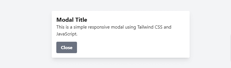
Building a Responsive Modal Dialog with Tailwind CSS and JavaScript.
<!DOCTYPE html>
<html lang="en">

<head>
  <meta charset="UTF-8" />
  <meta name="viewport" content="width=device-width, initial-scale=1.0" />
  <script src="https://cdn.tailwindcss.com"></script>
  <title>Tailwind CSS Modal With JavaScript</title>
</head>

<body class="bg-gray-100 flex items-center justify-center min-h-screen">
  <button id="openModal" class="bg-blue-500 hover:bg-blue-700 text-white font-bold py-2 px-4 rounded">Open Modal</button>

  <div id="modal" class="fixed top-0 left-0 w-full h-full flex items-center justify-center hidden">
      <div class="modal-dialog bg-white rounded shadow-lg sm:w-2/3 md:w-1/2 lg:w-1/3 xl:w-1/4">
          <div class="modal-content p-4">
              <h2 class="text-xl font-bold">Modal Title</h2>
              <p>This is a simple responsive modal using Tailwind CSS and JavaScript.</p>
              <button id="closeModal" class="bg-gray-500 hover:bg-gray-700 text-white font-bold py-2 px-4 rounded mt-4">Close</button>
          </div>
      </div>
  </div>

  <script src="modal.js"></script>
</body>

</html>
JavaScript (modal.js):
const openModalButton = document.getElementById("openModal");
const closeModalButton = document.getElementById("closeModal");
const modal = document.getElementById("modal");

openModalButton.addEventListener("click", () => {
    modal.classList.remove("hidden");
});

closeModalButton.addEventListener("click", () => {
    modal.classList.add("hidden");
});

document.addEventListener("click", (event) => {
    if (event.target === modal) {
        modal.classList.add("hidden");
    }
});
tailwind responsive modal dialog with javascript
Example 4
Creating an Animated Modal Dialog with Tailwind CSS and JavaScript.
<!DOCTYPE html>
<html lang="en">

<head>
  <meta charset="UTF-8" />
  <meta name="viewport" content="width=device-width, initial-scale=1.0" />
  <script src="https://cdn.tailwindcss.com"></script>
  <title>Tailwind CSS Modal With JavaScript</title>
</head>

<body class="bg-gray-100 flex items-center justify-center min-h-screen">
  <button id="openModal" class="bg-blue-500 hover:bg-blue-700 text-white font-bold py-2 px-4 rounded">
    Open Modal
  </button>

  <div id="modal"
    class="fixed top-0 left-0 w-full h-full flex items-center justify-center hidden transition-transform duration-300 transform scale-0">
    <div class="modal-dialog bg-white rounded shadow-lg sm:w-2/3 md:w-1/2 lg:w-1/3 xl:w-1/4">
      <div class="modal-content p-4">
        <h2 class="text-xl font-bold">Modal Title</h2>
        <p>
          This is a simple responsive modal using Tailwind CSS and JavaScript.
        </p>
        <button id="closeModal" class="bg-gray-500 hover:bg-gray-700 text-white font-bold py-2 px-4 rounded mt-4">
          Close
        </button>
      </div>
    </div>
  </div>

  <script src="modal.js"></script>
</body>

</html>
JavaScript (modal.js):
const openModalButton = document.getElementById("openModal");
const closeModalButton = document.getElementById("closeModal");
const modal = document.getElementById("modal");

openModalButton.addEventListener("click", () => {
    modal.classList.remove("hidden");
    modal.classList.remove("scale-0");
    modal.classList.add("scale-100");
});

closeModalButton.addEventListener("click", () => {
    modal.classList.remove("scale-100");
    modal.classList.add("scale-0");
    setTimeout(() => {
        modal.classList.add("hidden");
    }, 300);
});

document.addEventListener("click", (event) => {
    if (event.target === modal) {
        modal.classList.remove("scale-100");
        modal.classList.add("scale-0");
        setTimeout(() => {
            modal.classList.add("hidden");
        }, 300);
    }
});