In this tutorial, we’ll cover a simple Vue.js navbar menu, a responsive navbar in Vue 3, a navbar with a hamburger menu, and creating a navbar using the Vue 3 composition API. All examples will be demonstrated using Tailwind CSS & Vue 3.
Example 1
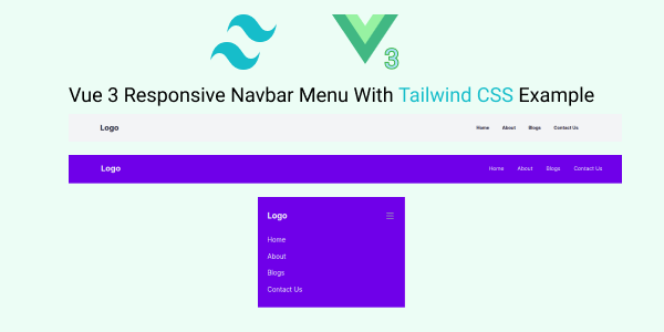
Simple Responsive Navbar in Vue 2 or Vue 3 with Tailwind CSS.
Vue
<template>
    <div>
        <div class="bg-gray-100">
            <nav class="container px-6 py-8 mx-auto md:flex md:justify-between md:items-center">
                <div class="flex items-center justify-between">
                    <router-link to="/" class="text-xl font-bold text-gray-800 md:text-2xl hover:text-blue-400">Logo
                    </router-link>
                    <!-- Mobile menu button -->
                    <div @click="showMenu = !showMenu" class="flex md:hidden">
                        <button type="button"
                            class="text-gray-800 hover:text-gray-400 focus:outline-none focus:text-gray-400">
                            <svg viewBox="0 0 24 24" class="w-6 h-6 fill-current">
                                <path fill-rule="evenodd"
                                    d="M4 5h16a1 1 0 0 1 0 2H4a1 1 0 1 1 0-2zm0 6h16a1 1 0 0 1 0 2H4a1 1 0 0 1 0-2zm0 6h16a1 1 0 0 1 0 2H4a1 1 0 0 1 0-2z">
                                </path>
                            </svg>
                        </button>
                    </div>
                </div>

                <!-- Mobile Menu open: "block", Menu closed: "hidden" -->
                <ul :class="showMenu ? 'flex' : 'hidden'"
                    class="flex-col mt-8 space-y-4 md:flex md:space-y-0 md:flex-row md:items-center md:space-x-10 md:mt-0">
                    <li class="text-sm font-bold text-gray-800 hover:text-blue-400">
                        Home
                    </li>
                    <li class="text-sm font-bold text-gray-800 hover:text-blue-400">
                        About
                    </li>
                    <li class="text-sm font-bold text-gray-800 hover:text-blue-400">
                        Blogs
                    </li>
                    <li class="text-sm font-bold text-gray-800 hover:text-blue-400">
                        Contact Us
                    </li>
                </ul>
            </nav>
        </div>
    </div>
</template>
<script>
export default {
    data() {
        return {
            showMenu: false,
        };
    },
};
</script>
You can also create method.
<div @click="toggleNav" class="flex md:hidden">
    <button type="button" class="text-gray-800 hover:text-gray-400 focus:outline-none focus:text-gray-400"
        aria-label="toggle menu">
        <svg viewBox="0 0 24 24" class="w-6 h-6 fill-current">
            <path fill-rule="evenodd"
                d="M4 5h16a1 1 0 0 1 0 2H4a1 1 0 1 1 0-2zm0 6h16a1 1 0 0 1 0 2H4a1 1 0 0 1 0-2zm0 6h16a1 1 0 0 1 0 2H4a1 1 0 0 1 0-2z">
            </path>
        </svg>
    </button>
</div>
Toggle method
<script>
export default {
    data() {
        return {
            showMenu: false,
        };
    },
    methods: {
        toggleNav: function () {
            this.showMenu = !this.showMenu;
        },
    },
};
</script>
Example 2
Create a responsive navbar with Tailwind CSS using Vue.js 3 Composition API.
Vue
<template>
    <div class="bg-indigo-600">
        <nav class="container px-6 py-8 mx-auto md:flex md:justify-between md:items-center">
            <div class="flex items-center justify-between">
                <router-link to="/" class="text-xl font-bold text-gray-100 md:text-2xl hover:text-indigo-400">Logo
                </router-link>
                <!-- Mobile menu button -->
                <div @click="toggleNav" class="flex md:hidden">
                    <button type="button"
                        class="text-gray-100 hover:text-gray-400 focus:outline-none focus:text-gray-400">
                        <svg viewBox="0 0 24 24" class="w-6 h-6 fill-current">
                            <path fill-rule="evenodd"
                                d="M4 5h16a1 1 0 0 1 0 2H4a1 1 0 1 1 0-2zm0 6h16a1 1 0 0 1 0 2H4a1 1 0 0 1 0-2zm0 6h16a1 1 0 0 1 0 2H4a1 1 0 0 1 0-2z">
                            </path>
                        </svg>
                    </button>
                </div>
            </div>

            <!-- Mobile Menu open: "block", Menu closed: "hidden" -->
            <ul :class="showMenu ? 'flex' : 'hidden'"
                class="flex-col mt-8 space-y-4 md:flex md:space-y-0 md:flex-row md:items-center md:space-x-10 md:mt-0">
                <li class="text-gray-100 hover:text-indigo-400">Home</li>
                <li class="text-gray-100 hover:text-indigo-400">About</li>
                <li class="text-gray-100 hover:text-indigo-400">Blogs</li>
                <li class="text-gray-100 hover:text-indigo-400">Contact Us</li>
            </ul>
        </nav>
    </div>
</template>
<script>
import { ref } from "vue";
export default {
    setup() {
        let showMenu = ref(false);
        const toggleNav = () => (showMenu.value = !showMenu.value);
        return { showMenu, toggleNav };
    },
};
</script>
Hamburger menu