In this tutorial, we will creating a responsive image gallery in Vue 3 using Tailwind CSS. We’ll cover different layouts such as flexbox and grid, and utilize Vue 3’s composition API.
Tool Use
Vue 3 or Vue js Composition api
Tailwind CSS 3.x
Pixabay Images
Example 1
Vue 3 simple responsive image gallery with tailwind css grid and flex.
Vue
<template>
    <div class="container mx-auto">
        <h2 class="py-4 text-3xl font-bold text-center text-indigo-600">
            Vue 3 Gallery Using Tailwind CSS Grid
        </h2>
        <div class="lg:gap-2 lg:grid lg:grid-cols-3">
            <div class="w-full rounded" v-for="image in images" :key="image.id">
                <img :src="image.photo" alt="image" />
            </div>
        </div>
        <h2 class="py-4 text-3xl font-bold text-center text-indigo-600">
            Vue 3 Gallery Using Tailwind CSS Flex
        </h2>
        <div class="flex flex-wrap">
            <div class="w-full lg:w-1/3" v-for="image in images" :key="image.id">
                <img :src="image.photo" alt="image" />
            </div>
        </div>
    </div>
</template>
<script>
export default {
    data() {
        return {
            images: [
                {
                    id: 1,
                    photo:
                        'https://cdn.pixabay.com/photo/2021/11/11/13/08/leopard-6786267__340.jpg',
                },
                {
                    id: 2,
                    photo:
                        'https://cdn.pixabay.com/photo/2020/07/01/17/34/wolf-5360340__340.jpg',
                },
                {
                    id: 3,
                    photo:
                        'https://cdn.pixabay.com/photo/2020/09/23/17/12/flowers-5596564__340.png',
                },
                {
                    id: 4,
                    photo:
                        'https://cdn.pixabay.com/photo/2021/10/27/08/43/forest-6746433__340.jpg',
                },
                {
                    id: 5,
                    photo:
                        'https://cdn.pixabay.com/photo/2021/11/03/09/25/squirrel-6765124__340.jpg',
                },
                {
                    id: 6,
                    photo:
                        'https://cdn.pixabay.com/photo/2021/05/09/06/07/dog-6240043__340.jpg',
                },
            ],
        };
    },
};
</script>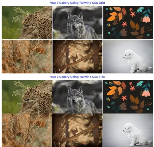
Example 2
Tailwind CSS responsive image gallery using vue js 3 composition api.
Vue
<template>
    <div class="container mx-auto">
        <h2 class="py-4 text-3xl font-bold text-center text-indigo-600">
            Vue 3 Gallery Using Tailwind CSS Grid
        </h2>
        <div class="lg:gap-2 lg:grid lg:grid-cols-3">
            <div class="w-full rounded" v-for="image in images" :key="image.id">
                <img :src="image.photo" alt="image" />
            </div>
        </div>
        <h2 class="py-4 text-3xl font-bold text-center text-indigo-600">
            Vue 3 Gallery Using Tailwind CSS Flex
        </h2>
        <div class="flex flex-wrap">
            <div class="w-full lg:w-1/3" v-for="image in images" :key="image.id">
                <img :src="image.photo" alt="image" />
            </div>
        </div>
    </div>
</template>
<script>
import { ref } from 'vue';
export default {
    setup() {
        let images = ref([
            {
                id: 1,
                photo:
                    'https://cdn.pixabay.com/photo/2021/11/11/13/08/leopard-6786267__340.jpg',
            },
            {
                id: 2,
                photo:
                    'https://cdn.pixabay.com/photo/2020/07/01/17/34/wolf-5360340__340.jpg',
            },
            {
                id: 3,
                photo:
                    'https://cdn.pixabay.com/photo/2020/09/23/17/12/flowers-5596564__340.png',
            },
            {
                id: 4,
                photo:
                    'https://cdn.pixabay.com/photo/2021/10/27/08/43/forest-6746433__340.jpg',
            },
            {
                id: 5,
                photo:
                    'https://cdn.pixabay.com/photo/2021/11/03/09/25/squirrel-6765124__340.jpg',
            },
            {
                id: 6,
                photo:
                    'https://cdn.pixabay.com/photo/2021/05/09/06/07/dog-6240043__340.jpg',
            },
        ]);

        return { images };
    },
};
</script>
