In this tutorial, we will creating a simple modal component in Vue.js using the composition API of Vue 3. We’ll cover various aspects such as basic modal functionality, popup modals, and the creation of modal components, all styled with Tailwind CSS.
Tool Use
Vue 3 or Vue js Composition api
Tailwind CSS 2.x / 3.x
Heroicons Icon
Example 1
Vue 3 simple modal with tailwind css.
Vue
<template>
    <div class="container mx-auto">
        <div class="flex justify-center">
            <button @click="isOpen = true" class="px-6 py-2 text-white bg-blue-600 rounded shadow" type="button">
                Open Model
            </button>

            <div v-show="isOpen" class="absolute inset-0 flex items-center justify-center bg-gray-700 bg-opacity-50">
                <div class="max-w-2xl p-6 bg-white rounded-md shadow-xl">
                    <div class="flex items-center justify-between">
                        <h3 class="text-2xl">Model Title</h3>
                        <svg @click="isOpen = false" xmlns="http://www.w3.org/2000/svg"
                            class="w-8 h-8 text-red-900 cursor-pointer" fill="none" viewBox="0 0 24 24"
                            stroke="currentColor">
                            <path stroke-linecap="round" stroke-linejoin="round" stroke-width="2"
                                d="M10 14l2-2m0 0l2-2m-2 2l-2-2m2 2l2 2m7-2a9 9 0 11-18 0 9 9 0 0118 0z" />
                        </svg>
                    </div>
                    <div class="mt-4">
                        <p class="mb-4 text-sm">Lorem ipsum dolor sit,...</p>
                        <button @click="isOpen = false" class="px-6 py-2 text-blue-800 border border-blue-600 rounded">
                            Cancel
                        </button>
                        <button class="px-6 py-2 ml-2 text-blue-100 bg-blue-600 rounded">
                            Save
                        </button>
                    </div>
                </div>
            </div>
        </div>
    </div>
</template>
<script>
export default {
    data() {
        return {
            isOpen: false,
        };
    },
};
</script>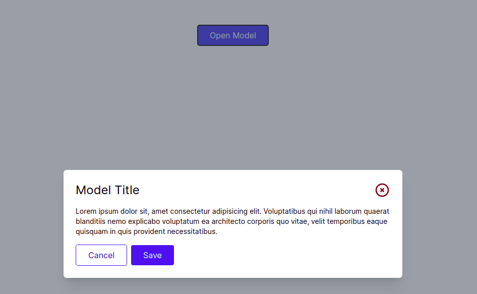
Example 2
Tailwind CSS responsive Modal using vue js 3 composition api.
Vue
<template>
    <div class="container mx-auto">
        <div class="flex justify-center">
            <button @click="isOpen = true" class="px-6 py-2 text-white bg-blue-600 rounded shadow" type="button">
                Open Model
            </button>

            <div v-show="isOpen" class="absolute inset-0 flex items-center justify-center bg-gray-700 bg-opacity-50">
                <div class="max-w-2xl p-6 mx-4 bg-white rounded-md shadow-xl">
                    <div class="flex items-center justify-between">
                        <h3 class="text-2xl">Model Title</h3>
                        <svg @click="isOpen = false" xmlns="http://www.w3.org/2000/svg"
                            class="w-8 h-8 text-red-900 cursor-pointer" fill="none" viewBox="0 0 24 24"
                            stroke="currentColor">
                            <path stroke-linecap="round" stroke-linejoin="round" stroke-width="2"
                                d="M10 14l2-2m0 0l2-2m-2 2l-2-2m2 2l2 2m7-2a9 9 0 11-18 0 9 9 0 0118 0z" />
                        </svg>
                    </div>
                    <div class="mt-4">
                        <p class="mb-4 text-sm">
                            Lorem ipsum dolor sit,...
                        </p>
                        <button @click="isOpen = false" class="px-6 py-2 text-blue-800 border border-blue-600 rounded">
                            Cancel
                        </button>
                        <button class="px-6 py-2 ml-2 text-blue-100 bg-blue-600 rounded">
                            Save
                        </button>
                    </div>
                </div>
            </div>
        </div>
    </div>
</template>
<script>
import { ref } from "vue";
export default {
    setup() {
        let isOpen = ref(false);
        return { isOpen };
    },
};
</script>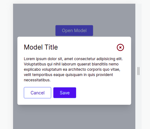
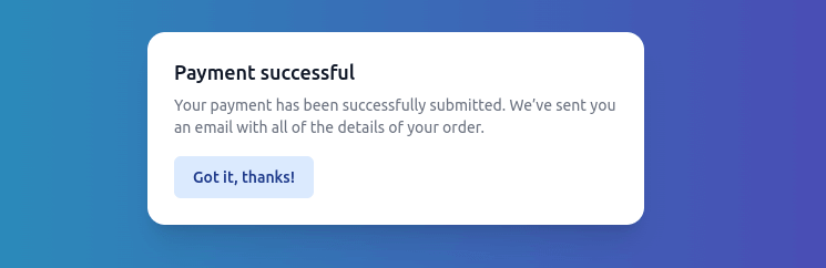
Tailwind CSS 3 Vue 3 modal with headlessui
To get started, install Headless UI via npm.
Please note that this library only supports Vue 3.
npm install @headlessui/vue<template>
<div class="fixed inset-0 flex items-center justify-center">
<button type="button" @click="openModal"
class="rounded-md bg-black bg-opacity-20 px-4 py-2 text-sm font-medium text-white hover:bg-opacity-30 focus:outline-none focus-visible:ring-2 focus-visible:ring-white focus-visible:ring-opacity-75">
Open dialog
</button>
</div>
<TransitionRoot appear :show="isOpen" as="template">
<Dialog as="div" @close="closeModal" class="relative z-10">
<TransitionChild as="template" enter="duration-300 ease-out" enter-from="opacity-0" enter-to="opacity-100"
leave="duration-200 ease-in" leave-from="opacity-100" leave-to="opacity-0">
<div class="fixed inset-0 bg-black bg-opacity-25" />
</TransitionChild>
<div class="fixed inset-0 overflow-y-auto">
<div class="flex min-h-full items-center justify-center p-4 text-center">
<TransitionChild as="template" enter="duration-300 ease-out" enter-from="opacity-0 scale-95"
enter-to="opacity-100 scale-100" leave="duration-200 ease-in" leave-from="opacity-100 scale-100"
leave-to="opacity-0 scale-95">
<DialogPanel
class="w-full max-w-md transform overflow-hidden rounded-2xl bg-white p-6 text-left align-middle shadow-xl transition-all">
<DialogTitle as="h3" class="text-lg font-medium leading-6 text-gray-900">
Payment successful
</DialogTitle>
<div class="mt-2">
<p class="text-sm text-gray-500">
Your payment has been successfully
submitted. We’ve sent you an email with all
of the details of your order.
</p>
</div>
<div class="mt-4">
<button type="button"
class="inline-flex justify-center rounded-md border border-transparent bg-blue-100 px-4 py-2 text-sm font-medium text-blue-900 hover:bg-blue-200 focus:outline-none focus-visible:ring-2 focus-visible:ring-blue-500 focus-visible:ring-offset-2"
@click="closeModal">
Got it, thanks!
</button>
</div>
</DialogPanel>
</TransitionChild>
</div>
</div>
</Dialog>
</TransitionRoot>
</template>
<script setup>
import { ref } from "vue";
import {
TransitionRoot,
TransitionChild,
Dialog,
DialogPanel,
DialogTitle,
} from "@headlessui/vue";
const isOpen = ref(true);
function closeModal() {
isOpen.value = false;
}
function openModal() {
isOpen.value = true;
}
</script>