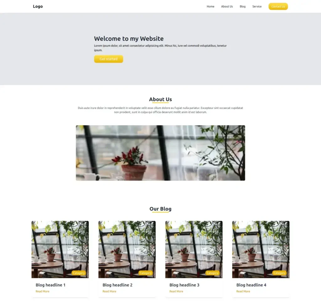
tailwind css simple responsive landing page template

Tailwind CSS simple landing page template. It’s fully responsive and built with Tailwind CSS and alpinejs . You can easily able to customize it for your needs.


FEATURES & Tools Use:

Tailwind CSS 2.x / 3.x

Alpinejs 2.x / 3.x

Heroicons

Responsive Navbar with Hamburger Menu

About Us Section

Our Blog Section

Contact Form Section

Easy to Customize


index.html

<!DOCTYPE html>
<html lang="en">
  <head>
    <meta charset="UTF-8" />
    <meta http-equiv="X-UA-Compatible" content="IE=edge" />
    <meta name="viewport" content="width=device-width, initial-scale=1.0" />
    <title>Tailwind CSS Simple Template</title>
    <script src="https://cdn.tailwindcss.com"></script>
    <script src="//unpkg.com/alpinejs" defer></script>
  </head>

  <body>
    <header class="bg-white" x-data="{ isOpen: false }">
      <nav class="container mx-auto px-8 py-4 md:flex md:items-center md:justify-between">
        <div class="flex items-center justify-between">
          <a class="text-xl font-bold text-gray-900 md:text-2xl" href="#">Logo</a>

          <!-- Mobile menu button -->
          <div @click="isOpen = !isOpen" class="flex md:hidden">
            <button type="button" class="text-gray-800 hover:text-gray-400 focus:text-gray-400 focus:outline-none" aria-label="toggle menu">
              <svg viewBox="0 0 24 24" class="h-6 w-6 fill-current">
                <path fill-rule="evenodd" d="M4 5h16a1 1 0 0 1 0 2H4a1 1 0 1 1 0-2zm0 6h16a1 1 0 0 1 0 2H4a1 1 0 0 1 0-2zm0 6h16a1 1 0 0 1 0 2H4a1 1 0 0 1 0-2z"></path>
              </svg>
            </button>
          </div>
        </div>

        <div :class="isOpen ? 'flex' : 'hidden'" class="mt-2 flex-col space-y-4 md:mt-0 md:flex md:flex-row md:items-center md:space-y-0 md:space-x-10">
          <a class="transform text-gray-800 hover:text-yellow-400" href="#">Home</a>
          <a class="transform text-gray-800 hover:text-yellow-400" href="#">About Us</a>
          <a class="transform text-gray-800 hover:text-yellow-400" href="#">Blog</a>
          <a class="transform text-gray-800 hover:text-yellow-400" href="#">Service</a>
          <a class="rounded-2xl border bg-gradient-to-b from-yellow-300 to-yellow-500 px-4 py-2 text-center text-white hover:shadow-xl" href="#">Contact Us</a>
        </div>
      </nav>
    </header>

    <!-- hero section -->
    <section class="bg-gray-200">
      <div class="flex justify-center">
        <div class="px-20 py-32 lg:w-1/2">
          <div class="w-full">
            <h1 class="mb-2 text-4xl font-medium text-gray-900">Welcome to my Website</h1>
            <div class="leading-relaxed">Lorem ipsum dolor, sit amet consectetur adipisicing elit. Minus hic, iure vel commodi voluptatibus, tenetur ipsum.</div>
            <button class="mt-4 rounded-xl bg-gradient-to-b from-yellow-300 to-yellow-500 px-8 py-2 text-xl text-white hover:shadow-2xl">Get started</button>
          </div>
        </div>
      </div>
    </section>

    <!-- about us -->
    <section class="bg-white">
      <div class="mx-auto max-w-5xl px-6 py-16 text-center">
        <div class="flex flex-col items-center justify-center">
          <h2 class="text-3xl font-semibold text-gray-800">About Us</h2>
          <div class="w-24 border-b-4 border-yellow-400"></div>
        </div>
        <p class="mt-4 text-gray-600">Duis aute irure dolor in reprehenderit in voluptate velit esse cillum dolore eu fugiat nulla pariatur. Excepteur sint occaecat cupidatat non proident, sunt in culpa qui officia deserunt mollit anim id est laborum.</p>

        <img class="mt-16 h-80 w-full rounded-md object-cover object-center shadow" src="https://source.unsplash.com/collection/190727/300x300" />
      </div>
    </section>

    <!-- Blog section -->
    <section class="container mx-auto mt-20">
      <div class="mb-12 flex flex-col items-center justify-center">
        <h2 class="text-3xl font-semibold text-gray-800">Our Blog</h2>
        <div class="w-24 border-b-4 border-yellow-400"></div>
      </div>
      <div class="grid gap-2 md:grid-cols-4">
        <div class="relative mx-6">
          <div class="rounded-lg bg-white shadow-md">
            <img src="https://source.unsplash.com/collection/190727/300x300" class="w-full rounded-t-lg" />
            <div class="absolute bottom-32 right-4 rounded-xl bg-yellow-500 px-2 py-0.5 text-white">Category</div>
            <div class="p-6">
              <h2 class="mb-2 text-2xl font-medium text-gray-800">Blog headline 1</h2>
              <a href="#" class="text-base text-yellow-600">Read More </a>
            </div>
          </div>
        </div>
        <div class="relative mx-6">
          <div class="rounded-lg bg-white shadow-md">
            <img src="https://source.unsplash.com/collection/190727/300x300" class="w-full rounded-t-lg" />
            <div class="absolute bottom-32 right-4 rounded-xl bg-yellow-500 px-2 py-0.5 text-white">Category</div>
            <div class="p-6">
              <h2 class="mb-2 text-2xl font-medium text-gray-800">Blog headline 2</h2>
              <a href="#" class="text-base text-yellow-600">Read More </a>
            </div>
          </div>
        </div>
        <div class="relative mx-6">
          <div class="rounded-lg bg-white shadow-md">
            <img src="https://source.unsplash.com/collection/190727/300x300" class="w-full rounded-t-lg" />
            <div class="absolute bottom-32 right-4 rounded-xl bg-yellow-500 px-2 py-0.5 text-white">Category</div>
            <div class="p-6">
              <h2 class="mb-2 text-2xl font-medium text-gray-800">Blog headline 3</h2>
              <a href="#" class="text-base text-yellow-600">Read More </a>
            </div>
          </div>
        </div>
        <div class="relative mx-6">
          <div class="rounded-lg bg-white shadow-md">
            <img src="https://source.unsplash.com/collection/190727/300x300" class="w-full rounded-t-lg" />
            <div class="absolute bottom-32 right-4 rounded-xl bg-yellow-500 px-2 py-0.5 text-white">Category</div>
            <div class="p-6">
              <h2 class="mb-2 text-2xl font-medium text-gray-800">Blog headline 4</h2>
              <a href="#" class="text-base text-yellow-600">Read More </a>
            </div>
          </div>
        </div>
      </div>
    </section>

    <!-- Our Services -->
    <section>
      <div class="container mx-auto px-5 py-24">
        <div class="mb-12 flex flex-col items-center justify-center">
          <h3 class="text-3xl">Our Services</h3>
          <div class="w-24 border-b-4 border-yellow-400"></div>
        </div>
        <div class="m-4 flex flex-wrap text-center">
          <div class="w-full p-4 lg:w-1/3">
            <div class="rounded-lg border-2 border-gray-200 px-4 py-6">
              <svg xmlns="http://www.w3.org/2000/svg" class="mb-3 inline-block h-20 w-20 text-yellow-300" fill="none" viewBox="0 0 24 24" stroke="currentColor">
                <path d="M12 14l9-5-9-5-9 5 9 5z" />
                <path d="M12 14l6.16-3.422a12.083 12.083 0 01.665 6.479A11.952 11.952 0 0012 20.055a11.952 11.952 0 00-6.824-2.998 12.078 12.078 0 01.665-6.479L12 14z" />
                <path stroke-linecap="round" stroke-linejoin="round" stroke-width="2" d="M12 14l9-5-9-5-9 5 9 5zm0 0l6.16-3.422a12.083 12.083 0 01.665 6.479A11.952 11.952 0 0012 20.055a11.952 11.952 0 00-6.824-2.998 12.078 12.078 0 01.665-6.479L12 14zm-4 6v-7.5l4-2.222" />
              </svg>
              <h2 class="title-font text-3xl font-medium text-gray-900">1.K</h2>
              <p class="leading-relaxed">Service 1</p>
            </div>
          </div>
          <div class="w-full p-4 lg:w-1/3">
            <div class="rounded-lg border-2 border-gray-200 px-4 py-6">
              <svg xmlns="http://www.w3.org/2000/svg" class="mb-3 inline-block h-20 w-20 text-yellow-300" fill="none" viewBox="0 0 24 24" stroke="currentColor">
                <path stroke-linecap="round" stroke-linejoin="round" stroke-width="2" d="M9 12l2 2 4-4M7.835 4.697a3.42 3.42 0 001.946-.806 3.42 3.42 0 014.438 0 3.42 3.42 0 001.946.806 3.42 3.42 0 013.138 3.138 3.42 3.42 0 00.806 1.946 3.42 3.42 0 010 4.438 3.42 3.42 0 00-.806 1.946 3.42 3.42 0 01-3.138 3.138 3.42 3.42 0 00-1.946.806 3.42 3.42 0 01-4.438 0 3.42 3.42 0 00-1.946-.806 3.42 3.42 0 01-3.138-3.138 3.42 3.42 0 00-.806-1.946 3.42 3.42 0 010-4.438 3.42 3.42 0 00.806-1.946 3.42 3.42 0 013.138-3.138z" />
              </svg>
              <h2 class="title-font text-3xl font-medium text-gray-900">1.2K</h2>
              <p class="leading-relaxed">Service 2</p>
            </div>
          </div>
          <div class="w-full p-4 lg:w-1/3">
            <div class="rounded-lg border-2 border-gray-200 px-4 py-6">
              <svg xmlns="http://www.w3.org/2000/svg" class="mb-3 inline-block h-20 w-20 text-yellow-300" fill="none" viewBox="0 0 24 24" stroke="currentColor">
                <path stroke-linecap="round" stroke-linejoin="round" stroke-width="2" d="M9 12l2 2 4-4m5.618-4.016A11.955 11.955 0 0112 2.944a11.955 11.955 0 01-8.618 3.04A12.02 12.02 0 003 9c0 5.591 3.824 10.29 9 11.622 5.176-1.332 9-6.03 9-11.622 0-1.042-.133-2.052-.382-3.016z" />
              </svg>
              <h2 class="title-font text-3xl font-medium text-gray-900">1.3K</h2>
              <p class="leading-relaxed">Service 3</p>
            </div>
          </div>
        </div>
      </div>
    </section>

    <section class="bg-gray-200 px-10 py-32">
      <div class="mx-auto rounded-lg bg-white p-10 shadow md:w-3/4 lg:w-1/2">
        <h3 class="text-center text-2xl font-bold">Form</h3>
        <form action="">
          <div class="lg:flex">
            <div class="mt-2 pr-1 lg:w-1/2">
              <input type="text" name="name" class="w-full rounded-full border border-gray-300 p-3 shadow focus:outline-none focus:ring-2 focus:ring-purple-600" placeholder="Enter you name" />
            </div>
            <div class="mt-2 pr-1 lg:ml-2 lg:w-1/2">
              <input type="text" name="name" class="w-full rounded-full border border-gray-300 p-3 shadow focus:outline-none focus:ring-2 focus:ring-purple-600" placeholder="Enter you Email" />
              <p class="mt-1 ml-4 text-sm text-red-400">Email field is required!</p>
            </div>
          </div>
          <div class="mt-2 block pr-1">
            <input type="text" name="name" class="w-full rounded-full border border-gray-300 p-3 shadow focus:outline-none focus:ring-2 focus:ring-purple-600" placeholder="Enter you name" />
          </div>
          <div>
            <textarea name="message" cols="10" rows="3" placeholder="message" class="mt-3 w-full rounded-xl border border-gray-300 p-3 shadow focus:outline-none focus:ring-2 focus:ring-purple-600"></textarea>
          </div>
          <div class="flex justify-center">
            <button type="submit" class="rounded-xl bg-yellow-400 px-8 py-2 text-white">Submit</button>
          </div>
        </form>
      </div>
    </section>

    <!-- footer -->
    <footer class="bg-gray-100 text-white">
      <div class="container mx-auto flex items-center px-5 py-8">
        <p class="text-sm text-black">
          @ 2022 Any —
          <a href="#" class="ml-1 text-black" target="_blank">www.Google.com</a>
        </p>
      </div>
    </footer>
  </body>
</html>