In this tutorial, we will creating a responsive image gallery with flexbox using Tailwind CSS. We will cover examples for small and medium screen sizes, demonstrating how to create responsive image galleries with Tailwind CSS.
Tailwind CSS Responsive Gallery Example
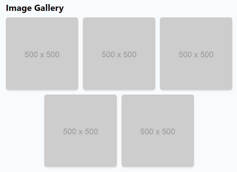
We’re using flex and flex-wrap utilities to create a flexible image container, centering the images horizontally with justify-center. The -mx-2 class removes gaps between images, while w-full ensures each image takes up the full width of its parent. Responsive classes like sm:w-1/2, md:w-1/3, and lg:w-1/4 adjust image widths for different screen sizes. Padding (px-2) creates small gaps between images, and rounded-lg and shadow-md add rounded borders and subtle shadows. Replace placeholder URLs with actual image URLs and customize further with utility or custom classes.
<div class="container mx-auto py-8">
    <h1 class="text-3xl font-bold mb-4">Image Gallery</h1>
    <div class="flex flex-wrap justify-center -mx-2">
        <div class="w-full sm:w-1/2 md:w-1/3 lg:w-1/4 px-2 mb-4">
            <img src="https://via.placeholder.com/500" alt="Image 1" class="w-full rounded-lg shadow-md">
        </div>
        <div class="w-full sm:w-1/2 md:w-1/3 lg:w-1/4 px-2 mb-4">
            <img src="https://via.placeholder.com/500" alt="Image 2" class="w-full rounded-lg shadow-md">
        </div>
        <div class="w-full sm:w-1/2 md:w-1/3 lg:w-1/4 px-2 mb-4">
            <img src="https://via.placeholder.com/500" alt="Image 3" class="w-full rounded-lg shadow-md">
        </div>
        <div class="w-full sm:w-1/2 md:w-1/3 lg:w-1/4 px-2 mb-4">
            <img src="https://via.placeholder.com/500" alt="Image 4" class="w-full rounded-lg shadow-md">
        </div>
        <div class="w-full sm:w-1/2 md:w-1/3 lg:w-1/4 px-2 mb-4">
            <img src="https://via.placeholder.com/500" alt="Image 5" class="w-full rounded-lg shadow-md">
        </div>
        <!-- Add more image elements as needed -->
    </div>
</div>
Image Gallery with Captions
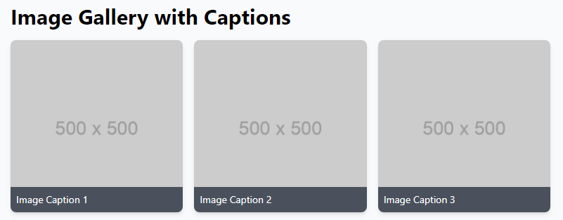
We’ve added captions to each image, positioning them at the bottom using absolute, bottom-0, left-0, and right-0 classes. The captions have a background color and padding with bg-gray-800, bg-opacity-75, text-white, p-2, and rounded-b-lg classes.
<div class="container mx-auto py-8">
    <h1 class="text-3xl font-bold mb-4">Image Gallery with Captions</h1>
    <div class="flex flex-wrap justify-center -mx-2">
        <div class="w-full sm:w-1/2 md:w-1/3 lg:w-1/4 px-2 mb-4">
            <div class="relative">
                <img src="https://via.placeholder.com/500" alt="Image 1" class="w-full rounded-lg shadow-md">
                <div class="absolute bottom-0 left-0 right-0 p-2 bg-gray-800 bg-opacity-75 text-white rounded-b-lg">
                    <p class="text-sm">Image Caption 1</p>
                </div>
            </div>
        </div>
        <div class="w-full sm:w-1/2 md:w-1/3 lg:w-1/4 px-2 mb-4">
            <div class="relative">
                <img src="https://via.placeholder.com/500" alt="Image 1" class="w-full rounded-lg shadow-md">
                <div class="absolute bottom-0 left-0 right-0 p-2 bg-gray-800 bg-opacity-75 text-white rounded-b-lg">
                    <p class="text-sm">Image Caption 2</p>
                </div>
            </div>
        </div>
        <div class="w-full sm:w-1/2 md:w-1/3 lg:w-1/4 px-2 mb-4">
            <div class="relative">
                <img src="https://via.placeholder.com/500" alt="Image 1" class="w-full rounded-lg shadow-md">
                <div class="absolute bottom-0 left-0 right-0 p-2 bg-gray-800 bg-opacity-75 text-white rounded-b-lg">
                    <p class="text-sm">Image Caption 3</p>
                </div>
            </div>
        </div>
        <!-- Add more image elements with captions as needed -->
    </div>
</div>
Image Gallery with Hover Effects
We’ve added a hover effect to the images using Tailwind’s transform, transition-transform, duration-500, and hover:scale-110 classes, creating a smooth scaling animation on hover. To prevent overflow and apply rounded corners, the parent container of each image uses overflow-hidden and rounded-lg classes.
<div class="container mx-auto py-8">
    <h1 class="mb-4 text-3xl font-bold">Image Gallery with Hover Effects</h1>
    <div class="-mx-2 flex flex-wrap justify-center">
        <div class="mb-4 w-full overflow-hidden rounded-lg px-2 shadow-md sm:w-1/2 md:w-1/3 lg:w-1/4">
            <img src="https://via.placeholder.com/500" alt="Image 1"
                class="w-full transform transition-transform duration-500 hover:scale-110" />
        </div>
        <div class="mb-4 w-full overflow-hidden rounded-lg px-2 shadow-md sm:w-1/2 md:w-1/3 lg:w-1/4">
            <img src="https://via.placeholder.com/500" alt="Image 1"
                class="w-full transform transition-transform duration-500 hover:scale-110" />
        </div>
        <div class="mb-4 w-full overflow-hidden rounded-lg px-2 shadow-md sm:w-1/2 md:w-1/3 lg:w-1/4">
            <img src="https://via.placeholder.com/500" alt="Image 1"
                class="w-full transform transition-transform duration-500 hover:scale-110" />
        </div>
        <!-- Add more image elements with hover effects as needed -->
    </div>
</div>