In this tutorial, we’ll explore examples of using the flex property in Tailwind CSS. We’ll cover various useful flex classes, including flex-direction (flex-row, flex-row-reverse, flex-col, flex-col-reverse), flex-wrap (flex-nowrap, flex-wrap, flex-wrap-reverse), and flex justify classes (justify-start, justify-end, justify-center, justify-between, justify-around, justify-evenly). We’ll illustrate each example with Tailwind CSS.
Example 1
Simple Flex Property
To create flex layout you need to set a parent element or div .flex class property.
<div class="flex gap-2">
  <div class="p-4 text-white bg-red-500">1</div>
  <div class="p-4 text-white bg-red-500">2</div>
  <div class="p-4 text-white bg-red-500">3</div>
  <div class="p-4 text-white bg-red-500">4</div>
  <div class="p-4 text-white bg-red-500">5</div>
  <div class="p-4 text-white bg-red-500">6</div>
</div>
Example 2
Flex Direction, Flex row.
The flex-direction property determines the direction in which the container stacks the flex items.
<div class="flex flex-row gap-2">
  <div class="p-4 text-white bg-red-500">1</div>
  <div class="p-4 text-white bg-red-500">2</div>
  <div class="p-4 text-white bg-red-500">3</div>
  <div class="p-4 text-white bg-red-500">4</div>
  <div class="p-4 text-white bg-red-500">5</div>
  <div class="p-4 text-white bg-red-500">6</div>
</div>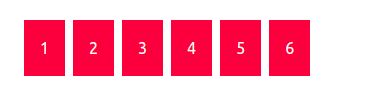
flex-row-reverse class property.
<div class="flex flex-row-reverse">
  <div class="p-4 text-white bg-red-500">1</div>
  <div class="p-4 text-white bg-red-500">2</div>
  <div class="p-4 text-white bg-red-500">3</div>
  <div class="p-4 text-white bg-red-500">4</div>
  <div class="p-4 text-white bg-red-500">5</div>
  <div class="p-4 text-white bg-red-500">6</div>
</div>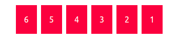
Flex column
flex-col class property.
<div class="flex flex-col w-16 gap-2">
  <div class="p-4 text-white bg-red-500">1</div>
  <div class="p-4 text-white bg-red-500">2</div>
  <div class="p-4 text-white bg-red-500">3</div>
  <div class="p-4 text-white bg-red-500">4</div>
  <div class="p-4 text-white bg-red-500">5</div>
  <div class="p-4 text-white bg-red-500">6</div>
</div>
flex-col-reverse class property.
<div class="flex flex-col-reverse w-40 gap-2">
  <div class="p-4 text-white bg-red-500">1</div>
  <div class="p-4 text-white bg-red-500">2</div>
  <div class="p-4 text-white bg-red-500">3</div>
  <div class="p-4 text-white bg-red-500">4</div>
  <div class="p-4 text-white bg-red-500">5</div>
  <div class="p-4 text-white bg-red-500">6</div>
</div>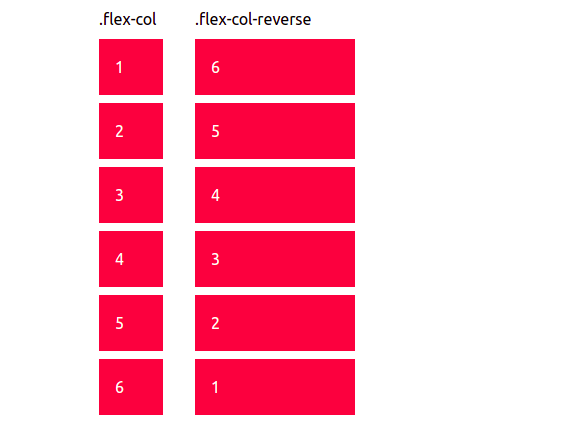
Example 3
Flex Wrap
flex-nowrap class property.
<div class="flex gap-2 flex-nowrap">
  <div class="w-1/5 p-4 text-white bg-red-500">1</div>
  <div class="w-1/5 p-4 text-white bg-red-500">2</div>
  <div class="w-1/5 p-4 text-white bg-red-500">3</div>
  <div class="w-1/5 p-4 text-white bg-red-500">4</div>
  <div class="w-1/5 p-4 text-white bg-red-500">5</div>
  <div class="w-1/5 p-4 text-white bg-red-500">6</div>
</div>
flex-wrap class property.
<div class="flex flex-wrap gap-2">
  <div class="w-1/5 p-4 text-white bg-red-500">1</div>
  <div class="w-1/5 p-4 text-white bg-red-500">2</div>
  <div class="w-1/5 p-4 text-white bg-red-500">3</div>
  <div class="w-1/5 p-4 text-white bg-red-500">4</div>
  <div class="w-1/5 p-4 text-white bg-red-500">5</div>
  <div class="w-1/5 p-4 text-white bg-red-500">6</div>
</div>
flex-wrap-reverse class property.
<div class="flex flex-wrap-reverse gap-2">
  <div class="w-1/5 p-4 text-white bg-red-500">1</div>
  <div class="w-1/5 p-4 text-white bg-red-500">2</div>
  <div class="w-1/5 p-4 text-white bg-red-500">3</div>
  <div class="w-1/5 p-4 text-white bg-red-500">4</div>
  <div class="w-1/5 p-4 text-white bg-red-500">5</div>
  <div class="w-1/5 p-4 text-white bg-red-500">6</div>
</div>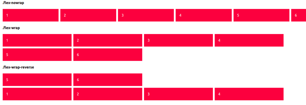
Example 4
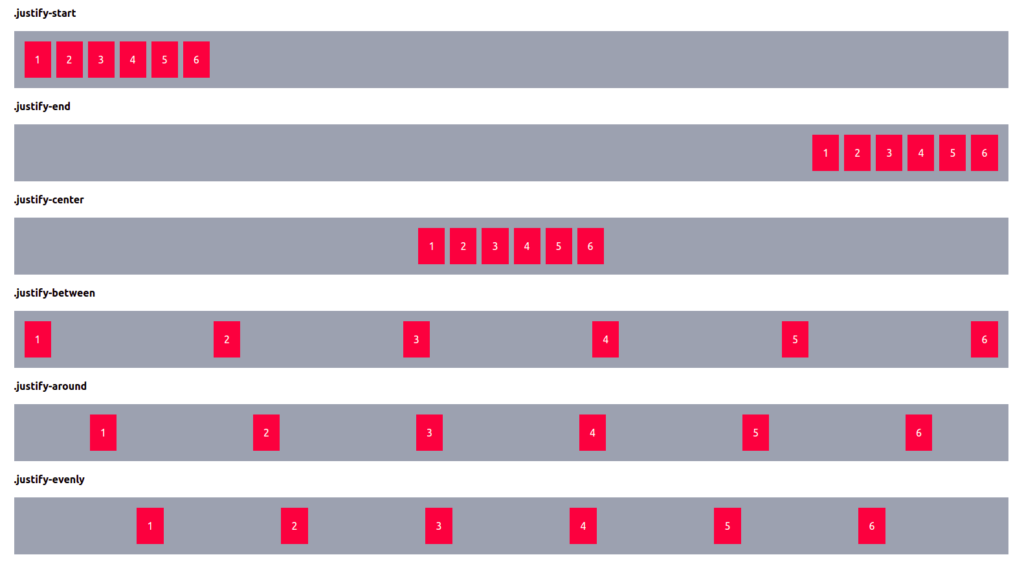
Tailwind CSS Flex Justify Content
Justify-start
<div class="flex justify-start gap-2 p-4 bg-gray-400">
  <div class="p-4 text-white bg-red-500">1</div>
  <div class="p-4 text-white bg-red-500">2</div>
  <div class="p-4 text-white bg-red-500">3</div>
  <div class="p-4 text-white bg-red-500">4</div>
  <div class="p-4 text-white bg-red-500">5</div>
  <div class="p-4 text-white bg-red-500">6</div>
</div>
justify-end
<div class="flex justify-end gap-2 p-4 bg-gray-400">
  <div class="p-4 text-white bg-red-500">1</div>
  <div class="p-4 text-white bg-red-500">2</div>
  <div class="p-4 text-white bg-red-500">3</div>
  <div class="p-4 text-white bg-red-500">4</div>
  <div class="p-4 text-white bg-red-500">5</div>
  <div class="p-4 text-white bg-red-500">6</div>
</div>
justify-center
<div class="flex justify-center gap-2 p-4 bg-gray-400">
  <div class="p-4 text-white bg-red-500">1</div>
  <div class="p-4 text-white bg-red-500">2</div>
  <div class="p-4 text-white bg-red-500">3</div>
  <div class="p-4 text-white bg-red-500">4</div>
  <div class="p-4 text-white bg-red-500">5</div>
  <div class="p-4 text-white bg-red-500">6</div>
</div>
justify-between
<div class="flex justify-between gap-2 p-4 bg-gray-400">
  <div class="p-4 text-white bg-red-500">1</div>
  <div class="p-4 text-white bg-red-500">2</div>
  <div class="p-4 text-white bg-red-500">3</div>
  <div class="p-4 text-white bg-red-500">4</div>
  <div class="p-4 text-white bg-red-500">5</div>
  <div class="p-4 text-white bg-red-500">6</div>
</div>
justify-around
<div class="flex justify-around gap-2 p-4 bg-gray-400">
  <div class="p-4 text-white bg-red-500">1</div>
  <div class="p-4 text-white bg-red-500">2</div>
  <div class="p-4 text-white bg-red-500">3</div>
  <div class="p-4 text-white bg-red-500">4</div>
  <div class="p-4 text-white bg-red-500">5</div>
  <div class="p-4 text-white bg-red-500">6</div>
</div>
justify-evenly
<div class="flex gap-2 p-4 bg-gray-400 justify-evenly">
  <div class="p-4 text-white bg-red-500">1</div>
  <div class="p-4 text-white bg-red-500">2</div>
  <div class="p-4 text-white bg-red-500">3</div>
  <div class="p-4 text-white bg-red-500">4</div>
  <div class="p-4 text-white bg-red-500">5</div>
  <div class="p-4 text-white bg-red-500">6</div>
</div>