In this section, we’ll explore responsive breakpoints in Tailwind CSS. We’ll look into customizing the default breakpoints, adding and adjusting fixed-range minimum and maximum breakpoints, and even renaming them to suit your needs.
Tailwind CSS provides an easy way to work with responsive breakpoints using utility classes. These breakpoints help you design your web application or website to adapt to different screen sizes. Tailwind CSS defines five default breakpoints for various screen sizes.
sm: Small screens (e.g., smartphones)
md: Medium screens (e.g., tablets)
lg: Large screens (e.g., laptops)
xl: Extra-large screens (e.g., desktops)
2xl: Extra-extra-large screens (e.g., larger desktops)
These default breakpoints are influenced by typical device screen resolutions:
tailwind.config.js
/** @type {import('tailwindcss').Config} */
module.exports = {
  theme: {
    screens: {
      'sm': '640px',
      // => @media (min-width: 640px) { ... }

      'md': '768px',
      // => @media (min-width: 768px) { ... }

      'lg': '1024px',
      // => @media (min-width: 1024px) { ... }

      'xl': '1280px',
      // => @media (min-width: 1280px) { ... }

      '2xl': '1536px',
      // => @media (min-width: 1536px) { ... }
    }
  }
}
The text size increases as the screen size gets larger. It starts at the base size and progressively gets larger at each breakpoint.
<p class="text-base sm:text-lg md:text-xl lg:text-2xl xl:text-3xl 2xl:text-4xl">
 This text size increases with screen size.
</p>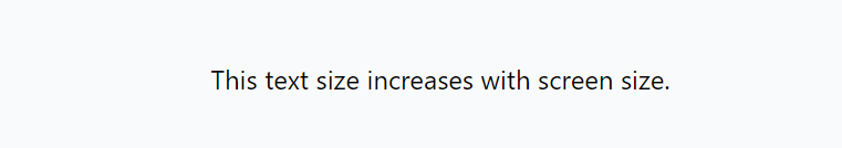
The element has different margins (m) and padding (p) at various breakpoints. The margins and padding increase as the screen size gets larger.
<div class="m-2 sm:m-4 md:m-6 lg:m-8 xl:m-10 2xl:m-12 p-4 sm:p-8 md:p-12 lg:p-16 xl:p-20 2xl:p-24">
 This element has different margins and padding at different breakpoints.
</div>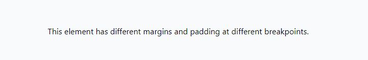
The element is hidden on medium-sized screens (md) but is displayed on small (sm), large (lg), extra-large (xl), and extra-extra-large (2xl) screens.
<div class="hidden sm:block md:hidden lg:block xl:hidden 2xl:block">
 This element is hidden on medium-sized screens.
</div>
How to Customizing Default Breakpoints in Tailwind CSS
To override the default breakpoints in Tailwind CSS, you need to customize your Tailwind CSS configuration file (tailwind.config.js) to define your own breakpoints in the theme section. Here’s how you can do it.
tailwind.config.js
module.exports = {
 theme: {
  extend: {
   screens: {
    'sm': '480px',   // Small screens
    'md': '768px',   // Medium screens
    'lg': '1024px',   // Large screens
    'xl': '1280px',   // Extra-large screens
    '2xl': '1600px',  // Extra-extra-large screens
    '3xl': '1920px',  // Custom breakpoint
   },
  },
 },
 // ...
};
Now, you can use your custom breakpoints just like you would with the default ones.
<div class="bg-blue-500 sm:bg-green-500 md:bg-red-500 lg:bg-yellow-500 xl:bg-pink-500 2xl:bg-purple-500 3xl:bg-orange-500">
 This background color will change based on the custom screen sizes.
</div>
Customizing Breakpoints Screen Names in Tailwind CSS
Feel free to choose your own names for custom screens. Tailwind doesn’t limit you to the default sm/md/lg/xl/2xl convention.
tailwind.config.js
/** @type {import('tailwindcss').Config} */
module.exports = {
  theme: {
    screens: {
      'tablet': '640px',
      // => @media (min-width: 640px) { ... }

      'laptop': '1024px',
      // => @media (min-width: 1024px) { ... }

      'desktop': '1280px',
      // => @media (min-width: 1280px) { ... }
    },
  }
}
How to Fixed-range breakpoints
To set breakpoints for both minimum and maximum widths, combine the ‘min’ and ‘max’ keys.
tailwind.config.js
/** @type {import('tailwindcss').Config} */
module.exports = {
  theme: {
    screens: {
      'sm': {'min': '640px', 'max': '767px'},
      // => @media (min-width: 640px and max-width: 767px) { ... }

      'md': {'min': '768px', 'max': '1023px'},
      // => @media (min-width: 768px and max-width: 1023px) { ... }

      'lg': {'min': '1024px', 'max': '1279px'},
      // => @media (min-width: 1024px and max-width: 1279px) { ... }

      'xl': {'min': '1280px', 'max': '1535px'},
      // => @media (min-width: 1280px and max-width: 1535px) { ... }

      '2xl': {'min': '1536px'},
      // => @media (min-width: 1536px) { ... }
    },
  }
}
Custom Media Queries
If you want full control over the generated media query, use the raw key,
/** @type {import('tailwindcss').Config} */
module.exports = {
  theme: {
    extend: {
      screens: {
        'tall': { 'raw': '(min-height: 800px)' },
        // => @media (min-height: 800px) { ... }
      }
    }
  }
}