In this tutorial, we will see how to use card hover effect in tailwind css. We will create card hover effect using tailwind shadow class, responsive hover card example with Tailwind CSS 3.
How to install & setup Tailwind CSS v3
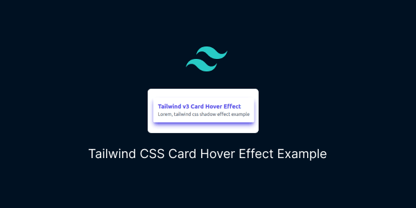
Example 1
A simple hover card effect, made with shadow class and tailwind css.
<!DOCTYPE html>
<html lang="en">

    <head>
        <meta charset="UTF-8" />
        <meta http-equiv="X-UA-Compatible" content="IE=edge" />
        <meta name="viewport" content="width=device-width, initial-scale=1.0" />
        <title>Tailwind CSS Card Hover Effect with Shadow </title>
        <script src="https://cdn.tailwindcss.com"></script>
    </head>

    <body>
        <div class="flex items-center justify-center h-screen">
            <div class="max-w-xs rounded shadow-lg hover:shadow-md">
                <div class="p-4">
                    <div>
                        <h2 class="text-xl font-bold text-indigo-600">
                            Tailwind v3 Card Hover Effect
                        </h2>
                        <p class="text-gray-600">
                            Lorem, tailwind css shadow effect example
                        </p>
                    </div>
                </div>
            </div>
        </div>
    </body>

</html>

tailwind css simple card hover effect
Tailwind CSS responsive card with hover effect.
<div class="w-full rounded shadow-lg lg:max-w-xs hover:shadow-md">
  <div class="p-4">
    <div>
      <h2 class="text-xl font-bold text-indigo-600">
        Tailwind v3 responsive Card Hover Effect
      </h2>
      <p class="text-gray-600">
        Lorem, tailwind css shadow effect example
      </p>
    </div>
  </div>
</div>
Example 2
tailwind css hover card effect with shadow and shadow color.
<!DOCTYPE html>
<html lang="en">

    <head>
        <meta charset="UTF-8" />
        <meta http-equiv="X-UA-Compatible" content="IE=edge" />
        <meta name="viewport" content="width=device-width, initial-scale=1.0" />
        <title>Tailwind CSS Card Hover Effect with Shadow Color </title>
        <script src="https://cdn.tailwindcss.com"></script>
    </head>

    <body>
        <div class="flex items-center justify-center h-screen">
            <div class="rounded shadow-lg hover:shadow-indigo-600 hover:shadow-md">
                <div class="p-4">
                    <div>
                        <h2 class="text-xl font-bold text-indigo-600">
                            Tailwind v3 Card Hover Effect
                        </h2>
                        <p class="text-gray-600">
                            Lorem, tailwind css shadow effect example
                        </p>
                    </div>
                </div>
            </div>
        </div>
    </body>

</html>

tailwind shadow color hover card effect
tailwind css transitions & animation hover card effect.
<div class="transition duration-300 transform rounded shadow-lg hover:shadow-indigo-600 hover:shadow-md">
  <div class="p-4">
    <div>
      <h2 class="text-xl font-bold text-indigo-600">
        Tailwind v3 Card Hover Effect
      </h2>
      <p class="text-gray-600">
        Lorem, tailwind css shadow effect example
      </p>
    </div>
  </div>
</div>
Example 3
Tailwind css hover scale card effect.
<!DOCTYPE html>
<html lang="en">

    <head>
        <meta charset="UTF-8" />
        <meta http-equiv="X-UA-Compatible" content="IE=edge" />
        <meta name="viewport" content="width=device-width, initial-scale=1.0" />
        <title>Tailwind CSS Card Hover Scale Effect </title>
        <script src="https://cdn.tailwindcss.com"></script>
    </head>

    <body>
        <div class="flex items-center justify-center h-screen">
            <div class="transition duration-300 transform rounded shadow-lg hover:scale-110">
                <div class="p-4">
                    <div>
                        <h2 class="text-xl font-bold text-indigo-600">
                            Tailwind v3 Card Hover Effect Scale Effect
                        </h2>
                        <p class="text-gray-600">
                            Lorem, tailwind css shadow effect example
                        </p>
                    </div>
                </div>
            </div>
        </div>
    </body>

</html>
tailwind css animation bounce hover card effect.
<div class="rounded shadow-lg hover:animate-bounce">
  <div class="p-4">
    <div>
      <h2 class="text-xl font-bold text-indigo-600">
        Tailwind v3 Card Hover Animation Effect
      </h2>
      <p class="text-gray-600">
        Lorem, tailwind css shadow effect example
      </p>
    </div>
  </div>
</div>