In this section, we’ll create UI badges such as Badge with Icon, Pill-shaped Badge, Badge with Counter for notifications, Outline Badge, Gradient Badge, Badge with Shadow, and a Badge Group example using Tailwind CSS.
Tailwind CSS Badge Example
Basic Badge
Create a simple blue badge with white text and rounded corners.
<span class="px-2 py-1 text-sm bg-blue-500 text-white rounded">Badge</span>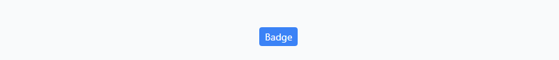
Badge with Icon
The badge includes an icon and uses the flex utility classes to align the icon and text horizontally.
<span class="flex text-sm items-center rounded bg-green-500 px-2 py-1 text-white">
    <svg class="mr-1 h-4 w-4" viewBox="0 0 24 24" fill="currentColor">
        <path
            d="M12 2C6.48 2 2 6.48 2 12s4.48 10 10 10 10-4.48 10-10S17.52 2 12 2zm5 11h-4v4h-2v-4H7v-2h4V7h2v4h4v2z" />
    </svg>
    <span>New</span>
</span>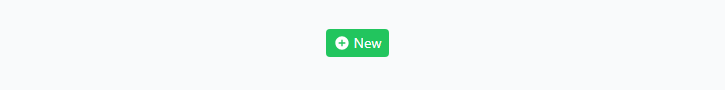
Pill-shaped Badge
By setting rounded-full, this badge will have a pill-shaped appearance with yellow background and dark gray text.
<span class="px-3 py-1 text-sm bg-yellow-400 text-gray-800 rounded-full">Warning</span>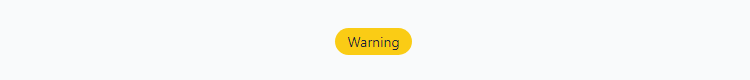
Badge with Counter
This badge includes a counter in the top-right corner, showcasing the use of positioning utilities and transformations.
<span class="relative inline-flex items-center rounded bg-blue-500 px-3 py-1 text-sm text-white">
    Notifications
    <span
        class="absolute right-0 top-0 inline-block h-4 w-4 -translate-y-1/2 translate-x-1/2 transform rounded-full bg-red-600 text-center text-xs text-white">3</span>
</span>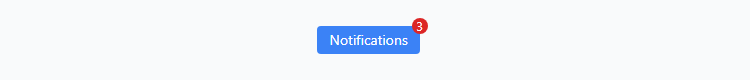
Outline Badge
Instead of a solid background, this badge has an outlined appearance with a blue border and blue text.
<span class="px-3 py-1 text-sm border border-blue-500 text-blue-500 rounded">Outline</span>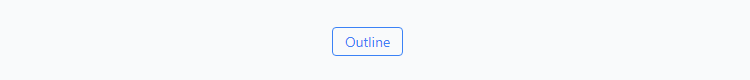
Gradient Badge
This badge uses the bg-gradient-to-r utility class to create a horizontal gradient background, transitioning from purple to pink.
<span class="rounded-md bg-gradient-to-r from-purple-500 to-pink-500 px-3 py-1 text-sm text-white"> Gradient </span>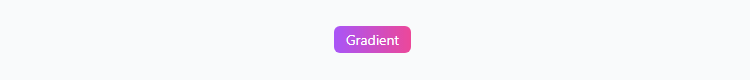
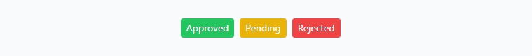
Badge Group
Create a showcase presenting a group of badges with different colors and meanings. Utilize the inline-flex and space-x-2 utility classes to display the badges horizontally with spacing between them.
<div class="inline-flex items-center space-x-2">
    <span class="rounded bg-green-500 px-2 py-1 text-sm text-white">Approved</span>
    <span class="rounded bg-yellow-500 px-2 py-1 text-sm text-white">Pending</span>
    <span class="rounded bg-red-500 px-2 py-1 text-sm text-white">Rejected</span>
</div>