In the world of responsive web design, controlling element widths is crucial. Tailwind CSS, a utility-first CSS framework, offers a powerful tool for this: the w-fit class. This class is equivalent to the CSS width: fit-content property, and it’s a game-changer for creating flexible, content-aware layouts. Let’s dive into how to use it effectively.
What is w-fit?
The w-fit class in Tailwind CSS sets an element’s width to fit its content. This means the element will be as wide as its content requires, but not wider than its parent container. It’s particularly useful when you want elements to shrink-wrap around their content rather than taking up the full width of their container.
How to Use w-fit
Basic Usage The simplest way to use w-fit is to add it directly to your HTML element:
<div class="w-fit bg-blue-500 p-4 text-white">
  This div will fit its content
</div>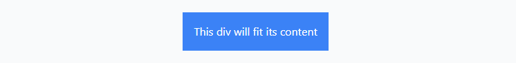
Responsive Design Tailwind’s responsive design system works seamlessly with w-fit. You can apply it at specific breakpoints:
<div class="w-full md:w-fit">
  Full width on small screens, fit-content on medium and up
</div>
Applying to Children If you want all children of a container to have fit-content width, use:
<div class="[&>*]:w-fit">
  <p>These paragraphs</p>
  <p>Will all have fit-content width</p>
</div>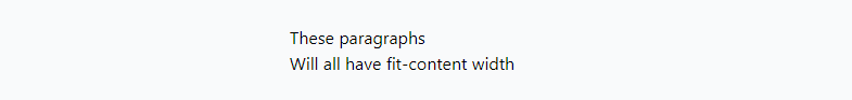
When to Use w-fit
w-fit is particularly useful in scenarios like:
- Creating buttons or badges that are only as wide as their text
- Building flexible navigation menus
- Aligning inline elements without excess space
- Creating responsive layouts where elements need to adjust based on content
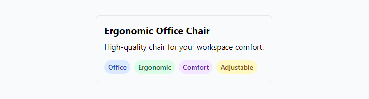
Product Tag System
Imagine an e-commerce site with a product tagging system. Tags can vary in length and number per product.
<div class="p-4 border rounded-lg">
  <h2 class="text-xl font-bold mb-2">Ergonomic Office Chair</h2>
  <p class="mb-4">High-quality chair for your workspace comfort.</p>
  <div class="flex flex-wrap gap-2">
    <span class="w-fit px-2 py-1 text-sm font-semibold bg-blue-100 text-blue-800 rounded-full">Office</span>
    <span class="w-fit px-2 py-1 text-sm font-semibold bg-green-100 text-green-800 rounded-full">Ergonomic</span>
    <span class="w-fit px-2 py-1 text-sm font-semibold bg-purple-100 text-purple-800 rounded-full">Comfort</span>
    <span class="w-fit px-2 py-1 text-sm font-semibold bg-yellow-100 text-yellow-800 rounded-full">Adjustable</span>
  </div>
</div>