To use an active button state after clicking it in Tailwind CSS, you can utilize the active utility class. The active class is applied when the button is clicked or activated
<button class="rounded bg-blue-500 px-4 py-2 text-white hover:bg-blue-700 active:bg-blue-800">
    Click me
</button>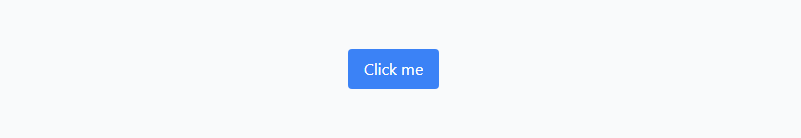
bg-blue-500 sets the initial background to blue. hover:bg-blue-700 changes it to a darker blue on hover. text-white makes the text white. font-bold makes the text bold. py-2 px-4 adds vertical (0.5rem) and horizontal (1rem) padding. rounded gives the button rounded corners. active:bg-blue-800 changes the background to an even darker blue when clicked, providing visual feedback.
Create a button that becomes active after clicking using the Tailwind CSS classes active:bg-blue-800, along with focus:outline-none and focus:ring focus:border-blue-300.
<button class="bg-blue-500 hover:bg-blue-700 text-white py-2 px-4 rounded focus:outline-none focus:ring focus:border-blue-300 active:bg-blue-800">
  Active Button
</button>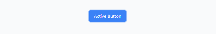
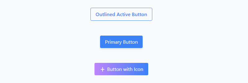
Active Button with Gradient and Icon in Tailwind CSS, Outlined Active Button.
  <div>
    <button class="rounded border border-blue-500 px-4 py-2 font-semibold text-blue-500 hover:bg-blue-500 hover:text-white focus:border-blue-300 focus:outline-none focus:ring">Outlined Active Button</button>
  </div>
  <div>
    <button class="rounded bg-blue-500 px-4 py-2 text-white shadow-md hover:bg-blue-700 focus:border-blue-300 focus:outline-none focus:ring active:bg-blue-800">Primary Button</button>
  </div>
  <div>
    <button class="rounded bg-gradient-to-r from-purple-400 to-blue-500 px-4 py-2 text-white hover:from-purple-500 hover:to-blue-600 focus:border-blue-300 focus:outline-none focus:ring active:bg-blue-800">
      <svg xmlns="http://www.w3.org/2000/svg" class="inline-block h-5 w-5" viewBox="0 0 20 20" fill="currentColor">
        <path fill-rule="evenodd" d="M10 2a1 1 0 00-1 1v5H5a1 1 0 100 2h4v5a1 1 0 102 0v-5h4a1 1 0 100-2h-4V3a1 1 0 00-1-1z" clip-rule="evenodd" />
      </svg>
      Button with Icon
    </button>
  </div>