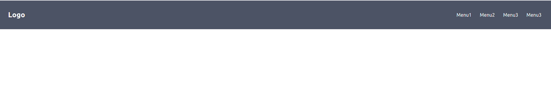
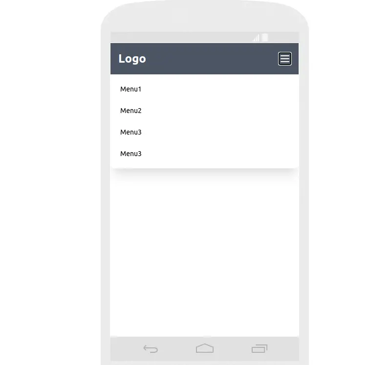
In this tutorial we will see simple mobile responsive navbar menu with tailwind css and alpine js 2.x .
Tool Use
Tailwind CSS 2.x / 3.x
Heroicons Icons
Alpine Js 2.x / 3.x
Setup Project
Tailwind CSS 2.x CDN
<link href="https://unpkg.com/tailwindcss@^2/dist/tailwind.min.css" rel="stylesheet">
Alpine js 2.x CDN
<script src="https://cdn.jsdelivr.net/gh/alpinejs/[email protected]/dist/alpine.min.js" defer></script>
Alpine js 3.v
<script defer src="https://unpkg.com/[email protected]/dist/cdn.min.js"></script>
Example
Simple mobile responsive menu with tailwind css and alpine js.
<!DOCTYPE html>
<html lang="en">

    <head>
        <meta charset="UTF-8">
        <meta http-equiv="X-UA-Compatible" content="IE=edge">
        <meta name="viewport" content="width=device-width, initial-scale=1.0">
        <title>Create Responsive Navbar in Tailwind CSS with Alpine js</title>
        <link href="https://unpkg.com/tailwindcss@^2/dist/tailwind.min.css" rel="stylesheet">
        <script src="https://cdn.jsdelivr.net/gh/alpinejs/[email protected]/dist/alpine.min.js" defer></script>

    </head>

    <body>
        <!-- header/navigation -->
        <div x-data="{ isOpen: false }" class="flex justify-between p-4 bg-gray-600 lg:p-8">
            <div class="flex items-center">
                <h3 class="text-2xl font-bold text-white">Logo</h3>
            </div>

            <!-- left header section -->
            <div class="flex items-center justify-between">
                <button @click="isOpen = !isOpen" type="submit">
                    <svg xmlns="http://www.w3.org/2000/svg" class="w-6 h-6 text-white lg:hidden" fill="none"
                        viewBox="0 0 24 24" stroke="currentColor">
                        <path stroke-linecap="round" stroke-linejoin="round" stroke-width="2"
                            d="M4 6h16M4 12h16M4 18h16" />
                    </svg>
                </button>
                <div class="hidden space-x-6 lg:inline-block">
                    <a href="#" class="text-base text-white ">Menu1</a>
                    <a href="#" class="text-base text-white ">Menu2</a>
                    <a href="#" class="text-base text-white ">Menu3</a>
                    <a href="#" class="text-base text-white ">Menu3</a>
                </div>

                <!-- mobile navbar -->
                <div class="mobile-navbar">
                    <!-- navbar wrapper -->
                    <div class="fixed left-0 w-full h-48 p-5 bg-white rounded-lg shadow-xl top-16" x-show="isOpen"
                        @click.away=" isOpen = false">
                        <div class="flex flex-col space-y-6">
                            <a href="#" class="text-sm text-black">Menu1</a>
                            <a href="#" class="text-sm text-black">Menu2</a>
                            <a href="#" class="text-sm text-black">Menu3</a>
                            <a href="#" class="text-sm text-black">Menu3</a>
                        </div>
                    </div>
                </div>
                <!-- end mobile navbar -->
            </div>
            <!-- right header section -->

        </div>

    </body>

</html>
tailwind css and alpine js nv
mobile responsive menu with tailwind css and alpine js