In this section we will see how to create responsive sidebar in next js using tailwind css. We will see responsive sidebar, collapsible sidebar using useState hooks with NEXT JS and Tailwind CSS.
Tool Use
NEXT JS
Tailwind CSS 3.v
Heroicons Icon
Example 1
Create responsive sidebar in next js with tailwind.
import Link from "next/link";
export default function Sidebar() {
return (
<div className="flex-row lg:flex">
<div className="flex flex-col w-full p-3 bg-white shadow lg:h-screen lg:w-72">
<div className="space-y-3">
<div className="flex items-center">
<h2 className="text-xl font-bold">Dashboard</h2>
</div>
<div className="relative">
<span className="absolute inset-y-0 left-0 flex items-center py-4">
<button
type="submit"
className="p-2 focus:outline-none focus:ring"
>
<svg
xmlns="http://www.w3.org/2000/svg"
className="w-6 h-6"
fill="none"
viewBox="0 0 24 24"
stroke="currentColor"
strokeWidth={2}
>
<path
strokeLinecap="round"
strokeLinejoin="round"
d="M21 21l-6-6m2-5a7 7 0 11-14 0 7 7 0 0114 0z"
/>
</svg>
</button>
</span>
<input
type="search"
name="Search"
placeholder="Search..."
className="w-full py-2 pl-10 text-sm rounded-md focus:outline-none"
/>
</div>
<div className="flex-1">
<ul className="pt-2 pb-4 space-y-1 text-sm">
<li className="rounded-sm">
<Link
href='/'
className="flex items-center p-2 space-x-3 rounded-md"
>
<svg
xmlns="http://www.w3.org/2000/svg"
className="w-6 h-6"
fill="none"
viewBox="0 0 24 24"
stroke="currentColor"
strokeWidth={2}
>
<path
strokeLinecap="round"
strokeLinejoin="round"
d="M3 12l2-2m0 0l7-7 7 7M5 10v10a1 1 0 001 1h3m10-11l2 2m-2-2v10a1 1 0 01-1 1h-3m-6 0a1 1 0 001-1v-4a1 1 0 011-1h2a1 1 0 011 1v4a1 1 0 001 1m-6 0h6"
/>
</svg>
<span>Home</span>
</Link>
</li>
<li className="rounded-sm">
<Link
href="/mail"
className="flex items-center p-2 space-x-3 rounded-md"
>
<svg
xmlns="http://www.w3.org/2000/svg"
className="w-6 h-6"
fill="none"
viewBox="0 0 24 24"
stroke="currentColor"
strokeWidth={2}
>
<path
strokeLinecap="round"
strokeLinejoin="round"
d="M20 13V6a2 2 0 00-2-2H6a2 2 0 00-2 2v7m16 0v5a2 2 0 01-2 2H6a2 2 0 01-2-2v-5m16 0h-2.586a1 1 0 00-.707.293l-2.414 2.414a1 1 0 01-.707.293h-3.172a1 1 0 01-.707-.293l-2.414-2.414A1 1 0 006.586 13H4"
/>
</svg>
<span>Inbox</span>
</Link>
</li>
<li className="rounded-sm">
<Link
href="/orders"
className="flex items-center p-2 space-x-3 rounded-md"
>
<svg
xmlns="http://www.w3.org/2000/svg"
className="w-6 h-6"
fill="none"
viewBox="0 0 24 24"
stroke="currentColor"
strokeWidth={2}
>
<path
strokeLinecap="round"
strokeLinejoin="round"
d="M16 11V7a4 4 0 00-8 0v4M5 9h14l1 12H4L5 9z"
/>
</svg>
<span>Orders</span>
</Link>
</li>
<li className="rounded-sm">
<Link
href="/settings"
className="flex items-center p-2 space-x-3 rounded-md"
>
<svg
xmlns="http://www.w3.org/2000/svg"
className="w-6 h-6"
fill="none"
viewBox="0 0 24 24"
stroke="currentColor"
strokeWidth={2}
>
<path
strokeLinecap="round"
strokeLinejoin="round"
d="M10.325 4.317c.426-1.756 2.924-1.756 3.35 0a1.724 1.724 0 002.573 1.066c1.543-.94 3.31.826 2.37 2.37a1.724 1.724 0 001.065 2.572c1.756.426 1.756 2.924 0 3.35a1.724 1.724 0 00-1.066 2.573c.94 1.543-.826 3.31-2.37 2.37a1.724 1.724 0 00-2.572 1.065c-.426 1.756-2.924 1.756-3.35 0a1.724 1.724 0 00-2.573-1.066c-1.543.94-3.31-.826-2.37-2.37a1.724 1.724 0 00-1.065-2.572c-1.756-.426-1.756-2.924 0-3.35a1.724 1.724 0 001.066-2.573c-.94-1.543.826-3.31 2.37-2.37.996.608 2.296.07 2.572-1.065z"
/>
<path
strokeLinecap="round"
strokeLinejoin="round"
d="M15 12a3 3 0 11-6 0 3 3 0 016 0z"
/>
</svg>
<span>Settings</span>
</Link>
</li>
<li className="rounded-sm">
<Link
href="/logout"
className="flex items-center p-2 space-x-3 rounded-md"
>
<svg
xmlns="http://www.w3.org/2000/svg"
className="w-6 h-6"
fill="none"
viewBox="0 0 24 24"
stroke="currentColor"
strokeWidth={2}
>
<path
strokeLinecap="round"
strokeLinejoin="round"
d="M11 16l-4-4m0 0l4-4m-4 4h14m-5 4v1a3 3 0 01-3 3H6a3 3 0 01-3-3V7a3 3 0 013-3h7a3 3 0 013 3v1"
/>
</svg>
<span>Logout</span>
</Link>
</li>
</ul>
</div>
</div>
</div>
<div className="container mx-auto mt-12">
<div className="grid grid-cols-1 gap-6 mb-6 lg:grid-cols-3">
<div className="w-full px-4 py-5 bg-white rounded-lg shadow">
<div className="text-sm font-medium text-gray-500 truncate">
Total users
</div>
<div className="mt-1 text-3xl font-semibold text-gray-900">
12,00
</div>
</div>
<div className="w-full px-4 py-5 bg-white rounded-lg shadow">
<div className="text-sm font-medium text-gray-500 truncate">
Total Profit
</div>
<div className="mt-1 text-3xl font-semibold text-gray-900">
$ 450k
</div>
</div>
<div className="w-full px-4 py-5 bg-white rounded-lg shadow">
<div className="text-sm font-medium text-gray-500 truncate">
Total Orders
</div>
<div className="mt-1 text-3xl font-semibold text-gray-900">
20k
</div>
</div>
</div>
</div>
</div>
);
}
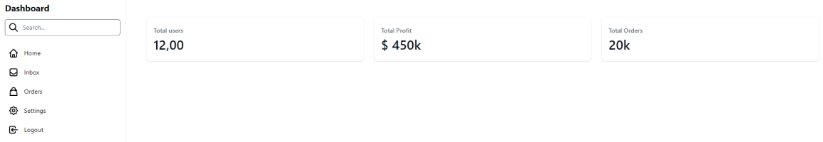
nextjs tailwind sidebar ui
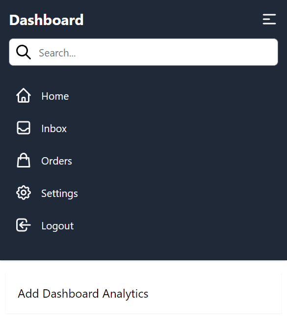
Example 2
Create Responsive Collapsible sidebar using useState hooks in next js with tailwind.
import { useState } from "react";
import Link from "next/link";

export default function Sidebar() {
  const [open, setOpen] = useState(false);
  return (
    <div className="flex-row lg:flex">
      <div
        className={` ${
          open ? "lg:w-40" : "lg:w-60 "
        } flex flex-col lg:h-screen p-3 w-full bg-gray-800 shadow duration-300`}
      >
        <div className="space-y-3">
          <div className="flex items-center justify-between">
            <h2 className="text-xl font-bold text-white">Dashboard</h2>
            <button onClick={() => setOpen(!open)}>
              <svg
                xmlns="http://www.w3.org/2000/svg"
                className="w-6 h-6 text-white"
                fill="none"
                viewBox="0 0 24 24"
                stroke="currentColor"
                strokeWidth={2}
              >
                <path
                  strokeLinecap="round"
                  strokeLinejoin="round"
                  d="M4 6h16M4 12h8m-8 6h16"
                />
              </svg>
            </button>
          </div>
          <div className="relative">
            <span className="absolute inset-y-0 left-0 flex items-center py-4">
              <button
                type="submit"
                className="p-2 focus:outline-none focus:ring"
              >
                <svg
                  xmlns="http://www.w3.org/2000/svg"
                  className="w-6 h-6"
                  fill="none"
                  viewBox="0 0 24 24"
                  stroke="currentColor"
                  strokeWidth={2}
                >
                  <path
                    strokeLinecap="round"
                    strokeLinejoin="round"
                    d="M21 21l-6-6m2-5a7 7 0 11-14 0 7 7 0 0114 0z"
                  />
                </svg>
              </button>
            </span>
            <input
              type="search"
              name="Search"
              placeholder="Search..."
              className="w-full py-2 pl-10 text-sm rounded-md focus:outline-none"
            />
          </div>
          <div className="flex-1">
            <ul className="pt-2 pb-4 space-y-1 text-sm">
              <li className="rounded-sm">
                <Link
                  href="/"
                  className="flex items-center p-2 space-x-3 rounded-md"
                >
                  <svg
                    xmlns="http://www.w3.org/2000/svg"
                    className="w-6 h-6 text-gray-100"
                    fill="none"
                    viewBox="0 0 24 24"
                    stroke="currentColor"
                    strokeWidth={2}
                  >
                    <path
                      strokeLinecap="round"
                      strokeLinejoin="round"
                      d="M3 12l2-2m0 0l7-7 7 7M5 10v10a1 1 0 001 1h3m10-11l2 2m-2-2v10a1 1 0 01-1 1h-3m-6 0a1 1 0 001-1v-4a1 1 0 011-1h2a1 1 0 011 1v4a1 1 0 001 1m-6 0h6"
                    />
                  </svg>
                  <span className="text-gray-100">Home</span>
                </Link>
              </li>
              <li className="rounded-sm">
                <Link
                  href="mail"
                  className="flex items-center p-2 space-x-3 rounded-md"
                >
                  <svg
                    xmlns="http://www.w3.org/2000/svg"
                    className="w-6 h-6 text-gray-100"
                    fill="none"
                    viewBox="0 0 24 24"
                    stroke="currentColor"
                    strokeWidth={2}
                  >
                    <path
                      strokeLinecap="round"
                      strokeLinejoin="round"
                      d="M20 13V6a2 2 0 00-2-2H6a2 2 0 00-2 2v7m16 0v5a2 2 0 01-2 2H6a2 2 0 01-2-2v-5m16 0h-2.586a1 1 0 00-.707.293l-2.414 2.414a1 1 0 01-.707.293h-3.172a1 1 0 01-.707-.293l-2.414-2.414A1 1 0 006.586 13H4"
                    />
                  </svg>
                  <span className="text-gray-100">Inbox</span>
                </Link>
              </li>
              <li className="rounded-sm">
                <Link
                  href="/orders"
                  className="flex items-center p-2 space-x-3 rounded-md"
                >
                  <svg
                    xmlns="http://www.w3.org/2000/svg"
                    className="w-6 h-6 text-gray-100"
                    fill="none"
                    viewBox="0 0 24 24"
                    stroke="currentColor"
                    strokeWidth={2}
                  >
                    <path
                      strokeLinecap="round"
                      strokeLinejoin="round"
                      d="M16 11V7a4 4 0 00-8 0v4M5 9h14l1 12H4L5 9z"
                    />
                  </svg>
                  <span className="text-gray-100">Orders</span>
                </Link>
              </li>
              <li className="rounded-sm">
                <Link
                  href="settings"
                  className="flex items-center p-2 space-x-3 rounded-md"
                >
                  <svg
                    xmlns="http://www.w3.org/2000/svg"
                    className="w-6 h-6 text-gray-100"
                    fill="none"
                    viewBox="0 0 24 24"
                    stroke="currentColor"
                    strokeWidth={2}
                  >
                    <path
                      strokeLinecap="round"
                      strokeLinejoin="round"
                      d="M10.325 4.317c.426-1.756 2.924-1.756 3.35 0a1.724 1.724 0 002.573 1.066c1.543-.94 3.31.826 2.37 2.37a1.724 1.724 0 001.065 2.572c1.756.426 1.756 2.924 0 3.35a1.724 1.724 0 00-1.066 2.573c.94 1.543-.826 3.31-2.37 2.37a1.724 1.724 0 00-2.572 1.065c-.426 1.756-2.924 1.756-3.35 0a1.724 1.724 0 00-2.573-1.066c-1.543.94-3.31-.826-2.37-2.37a1.724 1.724 0 00-1.065-2.572c-1.756-.426-1.756-2.924 0-3.35a1.724 1.724 0 001.066-2.573c-.94-1.543.826-3.31 2.37-2.37.996.608 2.296.07 2.572-1.065z"
                    />
                    <path
                      strokeLinecap="round"
                      strokeLinejoin="round"
                      d="M15 12a3 3 0 11-6 0 3 3 0 016 0z"
                    />
                  </svg>
                  <span className="text-gray-100">Settings</span>
                </Link>
              </li>
              <li className="rounded-sm">
                <Link
                  href="/logout"
                  className="flex items-center p-2 space-x-3 rounded-md"
                >
                  <svg
                    xmlns="http://www.w3.org/2000/svg"
                    className="w-6 h-6 text-gray-100"
                    fill="none"
                    viewBox="0 0 24 24"
                    stroke="currentColor"
                    strokeWidth={2}
                  >
                    <path
                      strokeLinecap="round"
                      strokeLinejoin="round"
                      d="M11 16l-4-4m0 0l4-4m-4 4h14m-5 4v1a3 3 0 01-3 3H6a3 3 0 01-3-3V7a3 3 0 013-3h7a3 3 0 013 3v1"
                    />
                  </svg>
                  <span className="text-gray-100">Logout</span>
                </Link>
              </li>
            </ul>
          </div>
        </div>
      </div>
      <div className="container mx-auto mt-4 lg:mt-12">
        <div className="p-4 mx-2 shadow-sm">
          <p>Add Dashboard Analytics </p>
        </div>
      </div>
    </div>
  );
}
sidebar dashboard nextjs with tailwind css