In this tutorial, we’ll create a photo gallery, showcasing responsive image displays and examples of galleries with different row and column configurations using Bootstrap 5.
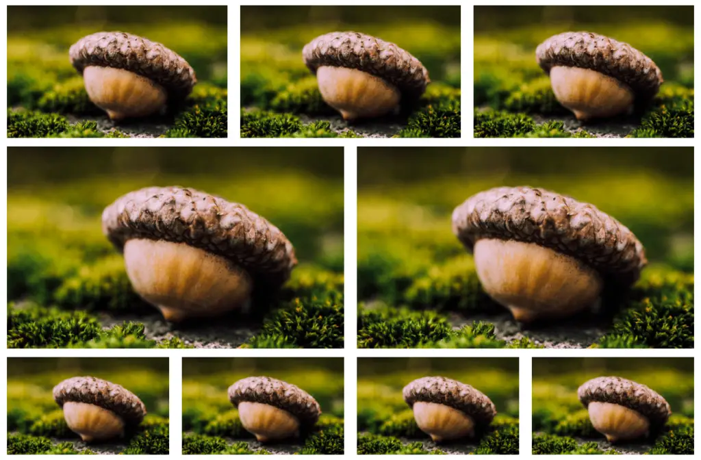
Example 1
4 columns responsive image gallery.
<div class="container">
    <div class="row">
        <div class="col-md-4 mt-3 col-lg-3">
            <img src="https://source.unsplash.com/collection/190727/1500x900" class="img-fluid" alt="image">
        </div>
        <div class="col-md-4 mt-3 col-lg-3">
            <img src="https://source.unsplash.com/collection/190727/1500x900" class="img-fluid" alt="image">
        </div>
        <div class="col-md-4 mt-3 col-lg-3">
            <img src="https://source.unsplash.com/collection/190727/1500x900" class="img-fluid" alt="image">
        </div>
        <div class="col-md-4 mt-3 col-lg-3">
            <img src="https://source.unsplash.com/collection/190727/1500x900" class="img-fluid" alt="image">
        </div>
        <div class="col-md-4 mt-3 col-lg-3">
            <img src="https://source.unsplash.com/collection/190727/1500x900" class="img-fluid" alt="image">
        </div>
        <div class="col-md-4 mt-3 col-lg-3">
            <img src="https://source.unsplash.com/collection/190727/1500x900" class="img-fluid" alt="image">
        </div>
        <div class="col-md-4 mt-3 col-lg-3">
            <img src="https://source.unsplash.com/collection/190727/1500x900" class="img-fluid" alt="image">
        </div>
        <div class="col-md-4 mt-3 col-lg-3">
            <img src="https://source.unsplash.com/collection/190727/1500x900" class="img-fluid" alt="image">
        </div>
    </div>
</div>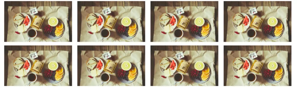
Example 2
3 columns responsive image gallery with rows style using eg. .row-cols-1 .row-cols-sm-2 .row-cols-md-3.
<div class="container">
    <div class="row row-cols-1 row-cols-sm-2 row-cols-md-3">
        <div class="col mt-3">
            <img src="https://source.unsplash.com/collection/190728/1500x900" class="img-fluid" alt="image">
        </div>
        <div class="col mt-3">
            <img src="https://source.unsplash.com/collection/190728/1500x900" class="img-fluid" alt="image">
        </div>
        <div class="col mt-3">
            <img src="https://source.unsplash.com/collection/190728/1500x900" class="img-fluid" alt="image">
        </div>
        <div class="col mt-3">
            <img src="https://source.unsplash.com/collection/190728/1500x900" class="img-fluid" alt="image">
        </div>
        <div class="col mt-3">
            <img src="https://source.unsplash.com/collection/190728/1500x900" class="img-fluid" alt="image">
        </div>
        <div class="col mt-3">
            <img src="https://source.unsplash.com/collection/190728/1500x900" class="img-fluid" alt="image">
        </div>
        <div class="col mt-3">
            <img src="https://source.unsplash.com/collection/190728/1500x900" class="img-fluid" alt="image">
        </div>
        <div class="col mt-3">
            <img src="https://source.unsplash.com/collection/190728/1500x900" class="img-fluid" alt="image">
        </div>
        <div class="col mt-3">
            <img src="https://source.unsplash.com/collection/190728/1500x900" class="img-fluid" alt="image">
        </div>
    </div>
</div>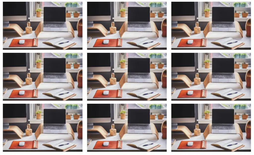
Example 3
Nested responsive image gallery.
<div class="container">
    <div class="row">
        <div class="col-md-4 mt-3 col-lg-4">
            <img src="https://source.unsplash.com/collection/190726/1500x900" class="img-fluid" alt="image">
        </div>
        <div class="col-md-4 mt-3 col-lg-4">
            <img src="https://source.unsplash.com/collection/190726/1500x900" class="img-fluid" alt="image">
        </div>
        <div class="col-md-4 mt-3 col-lg-4">
            <img src="https://source.unsplash.com/collection/190726/1500x900" class="img-fluid" alt="image">
        </div>
        <div class="col-md-4 mt-3 col-lg-6">
            <img src="https://source.unsplash.com/collection/190726/1500x900" class="img-fluid" alt="image">
        </div>
        <div class="col-md-4 mt-3 col-lg-6">
            <img src="https://source.unsplash.com/collection/190726/1500x900" class="img-fluid" alt="image">
        </div>
        <div class="col-md-4 mt-3 col-lg-3">
            <img src="https://source.unsplash.com/collection/190726/1500x900" class="img-fluid" alt="image">
        </div>
        <div class="col-md-4 mt-3 col-lg-3">
            <img src="https://source.unsplash.com/collection/190726/1500x900" class="img-fluid" alt="image">
        </div>
        <div class="col-md-4 mt-3 col-lg-3">
            <img src="https://source.unsplash.com/collection/190726/1500x900" class="img-fluid" alt="image">
        </div>
        <div class="col-md-4 mt-3 col-lg-3">
            <img src="https://source.unsplash.com/collection/190726/1500x900" class="img-fluid" alt="image">
        </div>
    </div>
</div>