In this tutorial, we will explore how to style placeholder text in forms using Tailwind CSS. We’ll cover various Tailwind CSS placeholder style classes and provide examples of changing the placeholder color.
How to install & setup Tailwind CSS v3
Example 1
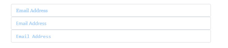
Customizing Placeholder Color in Tailwind CSS: Using Classes Using placeholder-blue-300, placeholder-green-300, placeholder-red-300.
<input
    type="email"
    class="w-full rounded border border-gray-300 px-4 py-2 placeholder-blue-300 outline-none focus:border-blue-500 focus:ring-1 focus:ring-blue-500"
    placeholder="Email Address"
/>
<input
    type="email"
    class="w-full rounded border border-gray-300 px-4 py-2 placeholder-green-300 outline-none focus:border-blue-500 focus:ring-1 focus:ring-blue-500"
    placeholder="Email Address"
/>
<input
    type="email"
    class="w-full rounded border border-gray-300 px-4 py-2 placeholder-red-300 outline-none focus:border-blue-500 focus:ring-1 focus:ring-blue-500"
    placeholder="Email Address"
/>
Example 2
Tailwind CSS Adjusting Placeholder Opacity with the placeholder-opacity-* class.
<input
    type="email"
    class="w-full px-4 py-2 placeholder-blue-300 placeholder-opacity-100 border border-gray-300 rounded outline-none focus:border-blue-500 focus:ring-1 focus:ring-blue-500"
    placeholder="Email Address"
/>
<input
    type="email"
    class="w-full px-4 py-2 placeholder-blue-300 placeholder-opacity-50 border border-gray-300 rounded outline-none focus:border-blue-500 focus:ring-1 focus:ring-blue-500"
    placeholder="Email Address"
/>
<input
    type="email"
    class="w-full px-4 py-2 placeholder-blue-300 placeholder-opacity-25 border border-gray-300 rounded outline-none focus:border-blue-500 focus:ring-1 focus:ring-blue-500"
    placeholder="Email Address"
/>
Example 3
Styling Placeholder Text as Italic in Tailwind CSS Using the placeholder:italic class.
<input
    type="email"
    class="w-full rounded border border-gray-300 px-4 py-2 placeholder-blue-300 outline-none placeholder:italic focus:border-blue-500 focus:ring-1 focus:ring-blue-500"
    placeholder="Email Address"
/>
Example 4
Customizing Placeholder Font Family in Tailwind CSS with placeholder:font-serif, placeholder:font-sans, and placeholder:font-mono Classes.
<input
    type="email"
    class="w-full px-4 py-2 placeholder-blue-300 border border-gray-300 rounded outline-none placeholder:font-serif focus:border-blue-500 focus:ring-1 focus:ring-blue-500"
    placeholder="Email Address"
/>
<input
    type="email"
    class="w-full px-4 py-2 placeholder-blue-300 border border-gray-300 rounded outline-none placeholder:font-sans focus:border-blue-500 focus:ring-1 focus:ring-blue-500"
    placeholder="Email Address"
/>
<input
    type="email"
    class="w-full px-4 py-2 placeholder-blue-300 border border-gray-300 rounded outline-none placeholder:font-mono focus:border-blue-500 focus:ring-1 focus:ring-blue-500"
    placeholder="Email Address"
/>
Example 5
Setting Placeholder Font Weight in Tailwind CSS with placeholder:font-light and placeholder:font-semibold Classes.
<input
    type="email"
    class="w-full px-4 py-2 placeholder-blue-300 border border-gray-300 rounded outline-none placeholder:font-light focus:border-blue-500 focus:ring-1 focus:ring-blue-500"
    placeholder="Email Address"
/>
<input
    type="email"
    class="w-full px-4 py-2 placeholder-blue-300 border border-gray-300 rounded outline-none placeholder:font-semibold focus:border-blue-500 focus:ring-1 focus:ring-blue-500"
    placeholder="Email Address"
/>